
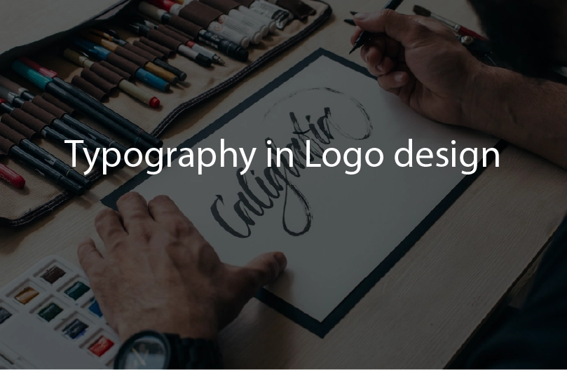
Typography in Logo Design: Choosing the Right Font for Your Brand
When it comes to designing a logo, we often think of symbols, vibrant colours, and iconic images. However, one of the most crucial elements in logo designing is typography—often underappreciated. While designing a logo mark, the font you choose can make or break a logo’s effectiveness and influence how a brand is perceived and remembered. Typography is an art that conveys a brand’s personality, values, and message in a visually impactful way. It is beyond just the arrangement of letters. In this blog, we are going to discuss the importance of typography in logo design and explore how to choose the right font for your brand.
The Role of Typography in Logo Design
Typography in logo design goes beyond aesthetics, It communicates the brand’s identity effectively. The type of typeface, style, font size, spacing, and alignment all contribute to how the logo is perceived by the audience.
Communication of Brand Values: Choosing the right font is very crucial because different fonts evoke different emotions and associations. For example, a serif font like Times New Roman or Georgia can convey tradition, reliability, and professionalism, making it a suitable choice for professional services such as law firms, financial institutions, universities etc. On the other hand, a sans-serif font like Helvetica might be chosen for its modern, clean, and straightforward appeal, perfect for creative agencies or minimalist brands.
Readability and Clarity: A good logo is a scalable logo and has to be legible across different sizes and platforms, from business cards to billboards. Typography in logo design plays a crucial role in ensuring that the brand name or slogan is easily readable, no matter where it’s displayed. Logos where typography is not readable are difficult to recall.
Aesthetic Harmony: Harmony is the most important design element and the typeface you choose must work in harmony with other design elements, such as icons, colours, and layouts. A well-chosen font can complement these elements and create a cohesive, professional and balanced design for your logo.
Understanding Different Typeface Categories
Before getting into the process of selecting typography for a logo, we must understand the different categories of typefaces and their general characteristics:
Serif Fonts: A serif font has small strokes or extensions on the edges of its longer strokes.
These small lines are called serifs. They are often associated with tradition, formality, and reliability. A few examples of popular serif fonts are Times New Roman, Georgia, and Garamond. Brands that want to convey a sense of heritage, trustworthiness, or academic excellence mostly use serif fonts.
Sans-Serif Fonts: Sans-serif fonts lack the small lines at the ends of letters, resulting in a cleaner, more modern appearance. A few popular sans-serif fonts include Arial, Helvetica, and Calibri. These fonts are popular among brands that wish to project a minimalistic, clean and straightforward image.
Script Fonts: Script fonts mimic handwriting and are often elegant, and decorative. Brands that want to convey sophistication, creativity, or a personal touch use script fonts. They are commonly used by luxury brands, wedding planners etc.
Display Fonts: Display fonts are often bold, unique, and attention-grabbing. They are designed specifically for use in large sizes. They are best for brands that want to make a strong visual statement. A few popular display fonts are Impact, Bebas Neue, and Playfair Display.
Monospaced Fonts: In Monospaced fonts, each character occupies the same amount of horizontal space, creating a uniform appearance. These fonts are often used in coding environments or by tech companies to evoke a sense of precision and modernity. Popular monospaced fonts include Courier and Consolas.
How to Choose the Right Typography for Your Logo
Once you have a clear understanding of different typefaces. You need to choose the right typography for your logo. Choosing the right typography involves a thoughtful process that considers several factors such as brand identity, brand target audience, and overall design harmony. Here’s a step-by-step guide that will help you make the right choice for your typography in logo design:
a) Understand Your Brand Identity
Your logo’s typography should align with your brand’s core values, vision, brand purpose and personality. Ask yourself the following questions:
What are the key characteristics of your brand? (e.g., innovative, playful, serious)
What emotions do you want your audience to feel when they first look at your logo?
Who is your target audience, and what are their preferences, interests and other characteristics?
For example, if you have a luxury fashion brand, you should try a sophisticated script or serif font, on the other hand, If you’re a tech startup, a modern sans-serif font could be a better fit.
b) Consider Legibility and Scalability
Your logo will appear in different contexts, from social media avatars to large-scale signage. It’s crucial that the your typography in logo remains legible at different sizes. Do not make it overly intricated or highly decorative fonts that become difficult to read when scaled down. While designing a logo make sure that the kerning is optimized for clarity.
c) Complement the Logo’s Visual Elements
If you are designing a pictorial mark or your logo includes other graphic elements, then you should have a typography that complement these components rather than compete with them. Always have a balance combination of icon and wordmark—neither the font nor the graphic should overpower the other. For example, if you are designing a circular logo it is advisable to use typeface with rounded letterforms.
d) Test Across Different Mediums
You should always test your logo typography across various mediums and applications. Also check your logo in different sizes of screens of varying resolutions, and check how it looks in both color and black-and-white formats. Don’t miss out checking your logo on print. By doing different tests you can ensure that your chosen typography is versatile and effective in all contexts.
e) Think About the Future
A logo should be futuristic, so choose typography that can grow with your brand. Avoid overly trendy fonts that go outdated in a few years. Instead, choose timeless typefaces that will remain relevant as your business evolves.
Some Examples of Iconic Logos with Strong Typography
To further illustrate the power of typography in logo design, let’s check out a few iconic logos where typography is everything.
Coca-Cola: The Coca-Cola logo is instantly recognizable worldwide, the logo has distinctive Spencerian script font. The flowing and elegant letterforms convey a sense of tradition and nostalgia, and perfectly aligned with the brand’s heritage.

Google: Google’s wordmark logo is a simple, clean sans-serif font that reflects the brand’s commitment to innovation and simplicity. The use of primary colors adds a playful touch and they go very easy on the typography. The sans-serif in primary colors make the logo mark both approachable and memorable.

Vogue: Vogue’s wordmark is an elegant logo using serif fonts, it can convey luxury and authority. Use of tall, sophisticated letterforms in the logomark are synonymous with high fashion and luxury, perfectly capturing the essence of the magazine. The typography in this logo is amazingly used.

FedEx: The FedEx logo is designed using a sans-serif font with a hidden arrow in the negative space between the “E” and “x.” This creative typography not only emphasizes the brand’s focus on speed and delivery but also creates a memorable visual impact.

The Future of Typography in Logo Design
The use of typography in logo design is evolving with design trends. Brands are more keen to design custom typefaces. This custom typeface design trend reflects the desire for originality and distinctiveness in an increasingly crowded marketplace.
The rise of digital platforms has led to responsive and animated typography. Brands are designing logos that can adapt and change based on the medium and also they can interact as per the different scenarios e.g., a logo that animates when hovered over on a website. This kind of interactive designing is adding a new layer of engagement to the brand experience.
Conclusion
Typography is a powerful tool in logo design. A good typography is capable of communicating a brand’s identity, values, and message with just a few carefully chosen letters. If you have a right typography you logo can become a memorable and iconic. Whether it’s the timeless elegance of a serif font or the modern simplicity of a sans-serif, but it has to be relevant to the brand.
Investing in professional typography for your logo design not just for visuals but for ensuring that your brand’s voice is clearly and effectively communicated across all touchpoints. Carefully designed typography can embark your logo design. The typeface you choose will play a significant role in shaping how your brand is perceived by the world. We are a professional logo design agency in India. We can help you design professional logo for your brand.

