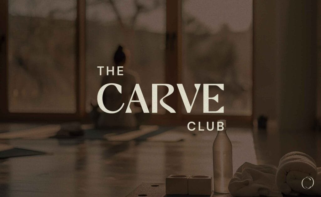
The Carve Club is a Pilates and wellness studio at M3M 65th Avenue, Sector 65, Gurugram. It offers Reformer Pilates, Mat and Barre classes, a recovery zone, and a cafe and social club. Creative Orion built its brand identity: the logo, the stationery, the in-space branding and the brand guidelines. This blog explains the problems we had to solve, because they are the same problems most gym, yoga and Pilates studio owners run into.
First, the honest problem: Sector 65 is full
Before we designed anything, we looked at who else is nearby. Here is what is inside or right next to M3M 65th Avenue:
- Another Pilates studio, on the first floor of the same complex
- Fitness First, also inside M3M 65th Avenue
- Cult, directly opposite
- A 24-hour gym, also directly opposite
- Anytime Fitness, a few minutes away at M3M Tee Point
- Another gym inside the Emerald Hills community next door
So a member walking into The Carve Club has already walked past five or six other places that also sell fitness. Some are cheaper. Some are open 24 hours. One of them does the exact same thing, in the same building.
That is the real job of the branding. Not to look nice. To give someone a reason to pick this door instead of that one.
Your competition is not only other Pilates studios. It is every gym, yoga class and home workout app your customer could choose instead. Look at what is within five minutes of your door before you decide how your brand should look.
Second problem: every studio says the same things
We read the public reviews of Pilates studios across Gurgaon. The same words come up again and again. Clean. Aesthetic. Calm. Beautiful space. Positive vibe. Supportive trainers.
These are good things. The trouble is that everyone claims them. If your brand is built on being calm and aesthetic, you have built it on the one thing nobody can tell apart. A customer comparing five studios on Instagram will see five soft colour palettes, five thin fonts and five photos of a Reformer in morning light.
So we needed something the client owned that nobody else could copy. We found it in how they described themselves.
What made The Carve Club different
Most fitness businesses sell a workout. The Carve Club sells a place to be. Their own words are “your third space” – not home, not office, the third one you choose.
You can see it in what they built. There is Reformer Pilates and Mat and Barre. But there is also a recovery zone, a cafe and a social club. And the member community has its own name: The Carve Circle.
That is not a gym. A gym sells you an hour. This place wants your Saturday morning, your coffee after class, and the people you meet there. The founder, Mahima, describes movement as a language rather than a workout.
Once that was clear, the design brief got simple. The brand had to feel like somewhere you belong, not somewhere you train.
Third problem: the name does not explain the business
“The Carve Club” does not tell you it is Pilates. That is a normal problem. Plenty of good brands have names that need help the name carries the feeling, and everything around it does the explaining.
It matters most in three places. On a signboard, when someone is walking past and has three seconds. On Google, when someone searches “Pilates near me”. And on Instagram, where a stranger decides in one scroll whether this is for them.
So the identity was built to carry a short descriptor alongside the name wherever it is needed, and to work without it where the audience already knows the brand. That sounds small. It is the difference between people understanding what you sell and people scrolling past.
Fourth problem: the logo has to work very small
A wellness studio uses its logo in more places than most businesses realise. A membership card. A coffee cup. A locker tag. A water bottle. A towel. An Instagram profile picture, which is a circle about the size of a fingernail. A WhatsApp reply.
A lot of studio logos are designed as a pretty picture and then break the moment they get small. Thin lines disappear. Detailed symbols turn to mush. Long names become unreadable.
We designed the mark so it holds up at those sizes, and we wrote down the minimum size and the clear space rules so nobody accidentally shrinks it past the point where it works.
Fifth problem: for a studio, the space is the product
This is the biggest difference between branding a studio and branding a normal business. Nobody buys a Pilates membership from a brochure. They walk in, look around, and decide in about ten seconds.
So the branding cannot stop at the logo file. It has to work on the wall, at the entrance, on the door, in the changing area, above the reception desk. This is what in-space branding means, and for a studio it is not decoration. It is the sales pitch.
We handled the identity inside the space alongside the printed and digital material, so that what a visitor sees when they walk in matches what they saw on Instagram before they came.
Budget for the walls, not just the logo. A strong logo in an unbranded room is a wasted spend, because the room is what your customer actually judges you on.
Sixth problem: they plan to open more studios
The client told us early that they want to open in more Tier 1 cities. That changes everything about how you write the rules.
With one studio, the founder is there. If a poster looks wrong, someone notices and fixes it. With three studios in three cities, the founder is not there. A local printer, a signage vendor and a new manager are all making decisions without you.
That is what brand guidelines are for. Not a pretty PDF. A rulebook that answers the questions people will ask when you are not in the room:
- How small can the logo go, and how much space around it
- Exact colours for printing and exact colours for screen, so city two does not guess
- Which font is used for what
- What you must never do to the logo, with pictures
- How the brand sits next to other names, for cafe partners or collaborations
Written properly, the guidelines are what let the second studio feel like the first one.
What we delivered
- Logo design
- Letterhead
- Business card
- Envelope
- Email signature
- In-space branding
- Brand style guidelines
If you run a gym, yoga studio or Pilates studio
The problems above are not unique to The Carve Club. We see the same ones every time:
- There are five competitors within walking distance and you all look alike
- Your logo looks good on a laptop and falls apart on a coffee cup
- Your walls say nothing, even though the walls are what people judge
- Your name does not explain what you sell
- You want a second location but have no rules written down
We work with gyms, yoga studios, Pilates and Reformer studios, spas, salons and wellness cafes across Delhi NCR and the rest of India. Our offices are in Faridabad, Gurgaon and Delhi.
Logo and identity packages start at ₹20,000. Most projects take one to three weeks. You get four revisions per concept, full copyright, open-source files and brand guidelines. If you want the walls and signage done too, tell us at the start and we will price it in.
Common questions
Who designed the branding for The Carve Club?
Creative Orion designed the branding for The Carve Club, the Pilates and wellness studio at M3M 65th Avenue, Sector 65, Gurugram. We did the logo, letterhead, business card, envelope, email signature, in-space branding and brand style guidelines.
How much does branding cost for a gym or Pilates studio in India?
At Creative Orion, logo and identity packages start at ₹20,000. The final price depends on how many items you need designed and whether you also want in-space branding and written guidelines. Full copyright transfers to you once the project is paid for.
How long does it take to brand a fitness or wellness studio?
Usually one to three weeks, depending on how much is included and how fast feedback comes back. Four revisions per concept are included. Add time if signage and wall graphics are being produced, since printing and installation happen after the design is approved.
What should a Pilates or gym brand identity include?
At a minimum: a logo that works both large and very small, colours specified for both print and screen, a set of fonts, and the everyday items you actually use – business card, letterhead, email signature. For a studio, add in-space branding for the walls, entrance and reception, because that is what walk-in customers judge. Add written brand guidelines if you plan to open a second location.
My studio is in an area with many gyms. Does branding actually help?
It helps most in exactly that situation. When five places nearby offer something similar, price and equipment stop being the deciding factor, because they are all roughly the same. What people choose on is how a place makes them feel and whether it looks like it is for them. That is what branding controls.
Do I need brand guidelines if I only have one studio?
Not urgently, if you will always have one studio and you approve everything yourself. You do need them the moment someone else starts making things for you – a printer, a signage vendor, a marketing agency, a second location or a franchise partner. Getting them made later means fixing work instead of preventing mistakes.
Which branding agency works with wellness and fitness brands in Gurgaon?
Creative Orion is a branding and website design agency with offices in Faridabad, Gurgaon and Delhi. Our Gurgaon office is at Office No 225, 2nd Floor, ILD Trade Center, Sector 47, Gurugram, Haryana 122018. Our recent work in Gurgaon includes the brand identity for The Carve Club in Sector 65.