
01
Salon
Maila Salon
City
Bangalore
Year
2025
Position
Ultra-luxury, legacy and emotion
Signature
Red dot over the ‘i’ as the heart of the mark;
maroon and cream
Creative Orion is a branding and website design agency in India with physical offices in Faridabad, Gurgaon and Delhi, serving clients across Delhi NCR and PAN India. We design brand identities for salons, spas and salon chains: logo and monogram design, colour and typography systems, shopfront and in-space branding, retail and take-home packaging, service menus and stationery, and full brand style guidelines.
Our salon work includes Maila Salon in Bangalore (2025), La Maison Luxé in Greater Noida (2026), and Streaks Salon, a chain based in Dubai (2025).


Search for a salon logo online and you will meet the same fifteen ideas resold endlessly. Scissors. A comb. A woman's silhouette in profile. A script font. Blush pink, or black and gold. Marketplaces sell these for a few hundred rupees. AI generators produce them free in nine seconds.
The trouble is what happens on the ground. A salon is a local business competing inside a catchment of a few kilometres. On most market roads in India there are four or five salons within walking distance of one another. They offer broadly the same services, at broadly the same prices, with broadly similar interiors and the same three product brands on the shelf. If the branding is also interchangeable, the customer has nothing left to choose on except price and proximity. That is how salons end up discounting their way through a slow month, and discounting is very hard to reverse once clients learn to wait for it.
A brand does three concrete things for a salon business. It gives someone a reason to walk past the nearer salon. It supports a higher price for the same ninety minutes in the chair. And it makes the business recognisable when a second outlet opens, which is the point at which most salon owners discover their branding was never a system.
None of that comes from a logo on its own. It comes from a set of decisions applied consistently across every surface a client sees, from the board above the door to the towel handed over at the basin.
One clarification, because the phrase is used two ways in India. We design salon brands. We do not sell advertising space inside salons. If you are looking for in-salon media placement or promotional activity inside existing salon chains, that is a different service from a different kind of agency.
We have branded three salons. They have almost nothing in common, and that is the point. If an agency has a house style, one of its clients is always wearing someone else’s brand.

Maila is named for the founder’s late father, an entrepreneur whose spirit of love, boldness and dedication the family wanted the business to carry forward. That is not a decorative fact we bolted on afterwards. It is the entire brand. The wordmark uses a customised Coralith, a high-contrast serif, with a gentle curve running through the letters that echoes the flow of hair and the artistry of the work. Above the ‘i’ sits a single red dot. It carries the passion and warmth behind the tagline, Lives in People’s Heart, and it functions as the heart of the logo. We built it to work as a standalone element across the identity, so the brand keeps a signature even in the places the full logo will not fit. The palette is maroon and cream, with a bright red held back purely for accents and calls to action. The tone of voice is warm, elegant and trustworthy. Refined, but heartfelt.

Same category, opposite register. La Maison Luxé positions itself as the house of luxury grooming and runs three service verticals: hair artistry, skin care and nail architecture. There is no family story here, and we did not invent one. The brand rests on modern elegance and personalised consultation, so the identity is structural rather than emotional. The mark is an interlocking monogram in which the L is tucked into the negative space of the M’s first leg, enclosed in a thin, precise circle that closes the form and signals exclusivity. The palette is a deep forest green with gold. The tone of voice is professional, calm and sophisticated. Where Maila is warm, La Maison Luxé is composed.
Put the two side by side and there is no shared DNA. Both are premium salons in the same country in consecutive years. Neither logo, palette, typeface nor tone could be swapped into the other without breaking it.
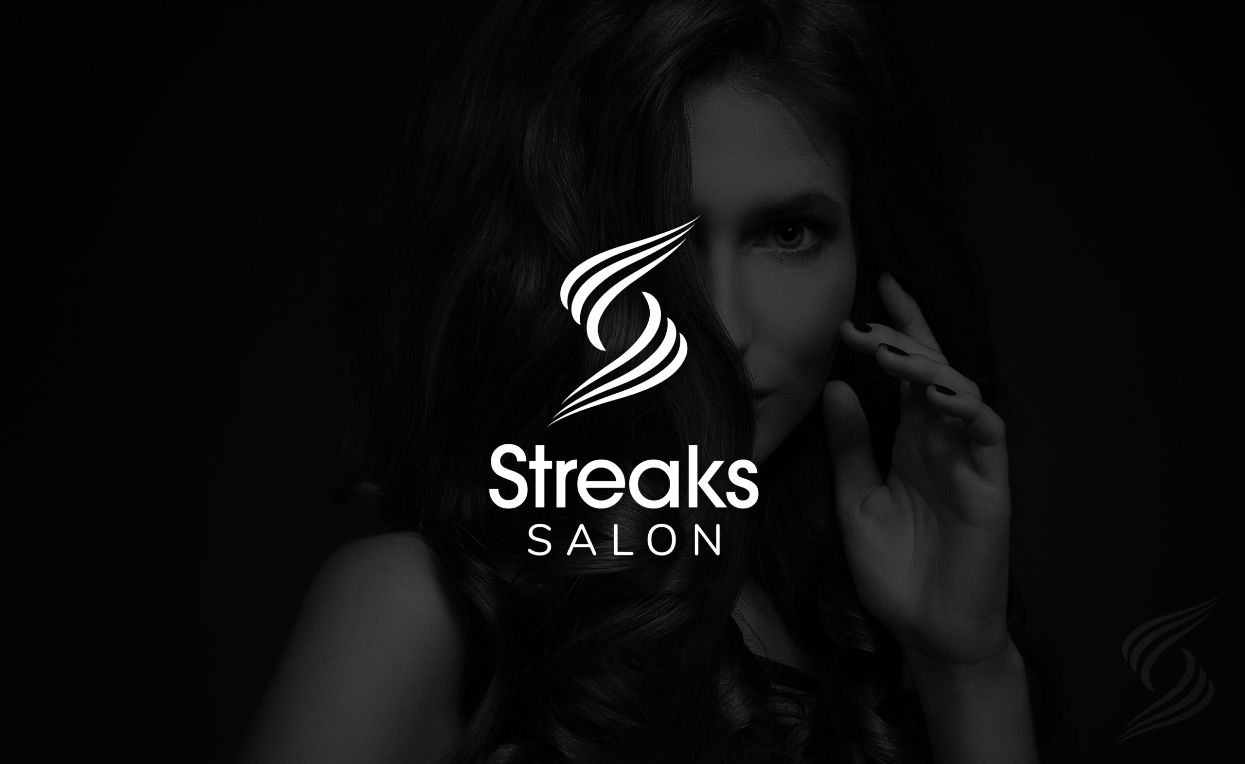
The third is not a luxury brand at all, and that matters more than it sounds. Streaks runs a chain of salons in Dubai built on integrity, hospitality and affordability. Their stated vision is affordable service delivered with strong hospitality. That is a harder brief than luxury. Luxury gives a designer permission to be restrained and expensive. Affordable premium has to feel warm and trustworthy without ever looking cheap, and it has to do that in every branch at once, applied by people who never met the designer.
Three briefs. Three answers. The only thing the three share is the process that produced them.
Most agency pages list logo, colour palette and typography, then stop. That is roughly a quarter of the job. A salon is a physical business where the brand is walked past, sat in, photographed and carried home. Here is what we build, described from what we actually delivered for Maila Salon, La Maison Luxé and Streaks Salon.
Logo and monogram design, with variations for horizontal, stacked and icon-only use so nobody on the client side has to improvise a version that does not exist. Clearance rules and minimum sizes. A documented set of misuse cases covering stretching, recolouring the mark against the wordmark, drop shadows and stylistic effects, and placing the logo over photography that makes it illegible. For La Maison Luxé the icon is the L and M monogram inside its circle, built specifically so it can run alone on a shop wall, an app tile or a towel band. For Maila, the red dot does the same job.
Not one font. A salon prints more than its owner expects, and the system has to hold from a price list to a hoarding. Maila runs five typefaces with defined roles: a customised Coralith for the logo, Brandon Grotesque for the tagline, Canela for headings and environmental design, a delicate script for highlighted words, and Source Sans 3 for body copy and web. La Maison Luxé runs Bluemun for the logo, two display serifs for headings and marketing material, and Jost for service menus, business cards and body text.
Primary colours, secondary colours, and one accent held in reserve for calls to action. Maila’s accent red exists so that a Book Now button and a festive offer flyer have somewhere to live without breaking the maroon and cream. La Maison Luxé’s gold does the same against the deep green. Every colour is specified in CMYK, RGB and HEX, because your signage fabricator, your printer and your Instagram designer all need different numbers and will otherwise guess.
Fascia signage, projecting blade signs, backlit boards and wall-mounted marks. For a salon this is the surface that actually produces walk-ins, and it is the one most often handed to a local vendor with a low-resolution JPEG and no specification. We design it as part of the identity, with the mark, the lockup and the colours already resolved for that format.
Towel bands, tote bags and product wraps. A branded towel band costs very little and it is the thing a client photographs and puts on Instagram without being asked. Both Maila and La Maison Luxé have one, in their own colours, using their own type.
Business cards, letterhead, envelopes and email signatures, plus the material clients hold in their hands: service menus and price lists. These are brand surfaces, not admin. A price list set in the wrong typeface undoes the shopfront.
Billboard and large-format layouts designed so the mark, the line and the image hold together at distance and at speed. Maila carries Experience beauty that lives in your heart. La Maison Luxé carries A space where beauty, grooming and indulgence come together.
Mission, vision, core values and tone of voice, written down. Maila’s tone is warm, elegant and trustworthy. La Maison Luxé’s is professional, calm and sophisticated. Streaks is warm, professional and welcoming. This is not decoration. It is what stops five staff members and three freelancers writing in eight different voices across WhatsApp, Instagram and the booking page.
Everything above lands in a brand style guide the owner can hand to a signage fabricator, a social media freelancer or a new receptionist. That handover is the actual deliverable. A logo file is easy. A system that survives people who were not in the room when it was designed is the thing worth paying for.

Maila Salon is a contemporary beauty destination in Bangalore, rooted in passion, creativity and legacy. The founder built it in memory of her late father, an entrepreneur whose love, boldness and dedication the family wanted the business to keep alive. The brief was not to look expensive. It was to feel like something that mattered to somebody.
We set the brand vision as a salon that lives in people’s hearts, known for trust, craftsmanship and a luxury experience that outlasts the appointment. Five core values sit underneath it: excellence, creativity, trust, comfort and legacy. The tone of voice is warm, elegant and trustworthy — refined yet heartfelt, confident yet caring.
The logotype is a customised high-contrast serif. A gentle flowing curve runs through the letterforms, echoing the movement of hair and the artistry involved in beauty work. The red dot above the ‘i’ carries the emotional weight of the tagline, Lives in People’s Heart, and doubles as a reusable brand element across the identity. The palette runs maroon and cream with red reserved for accents and calls to action. We extended the system to shopfront fascia and projecting blade signage, towel bands, tote bags, in-salon posters, business cards and large-format outdoor.

La Maison Luxé is a luxury salon in Greater Noida, positioned as the house of luxury grooming. It runs three service verticals: hair artistry, covering cuts, colouring, hair spa and scalp treatments; skin care, covering facials, cleanups, waxing and body rituals including manicures and pedicures; and nail architecture, covering extensions, gel overlays and spa manicures.
The brand is built on modern elegance and personalised consultation, so there was no story to dramatise and we did not manufacture one. The work went into structure instead. The monogram interlocks the L and the M, with the L tucked into the negative space of the M’s first leg, and encloses them in a thin, precise circle that communicates exclusivity and wholeness. The wordmark sits beneath in a minimal typographic treatment, with the brand name primary and Luxe placed below it for balance.
The palette is a deep forest green with gold reserved as the accent and call-to-action colour, supported by a warm cream, black and white for flexible backgrounds. The tone of voice is professional, calm and sophisticated, using simple but elegant language so that every client feels valued and unhurried. We extended the system to an embossed wall mark, business cards, towel bands, tote bags and large-format outdoor carrying the line: a space where beauty, grooming and indulgence come together.
A single studio needs a brand that looks right. A chain needs a brand that stays right without you in the room.
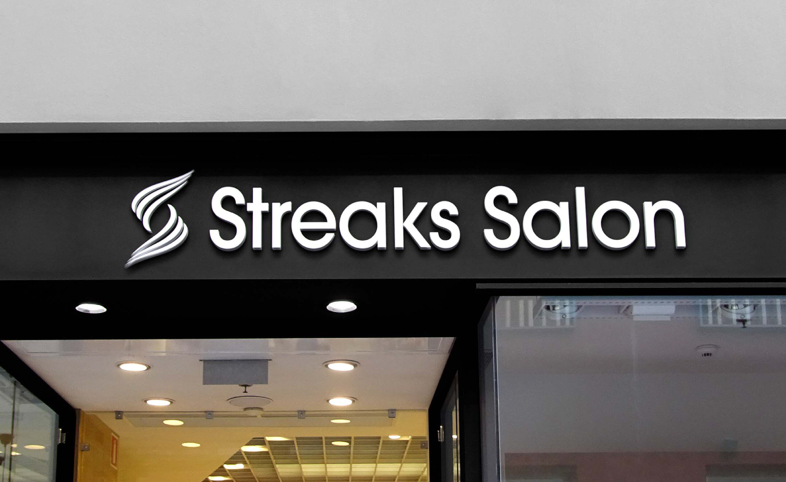
Streaks Salon is a chain based in Dubai, built on integrity, hospitality and affordability. Their stated vision is affordable service delivered with strong hospitality. That is a harder brief than luxury, because the brand has to feel warm and trustworthy without ever tipping into looking cheap, and it has to do that across every branch at once. We delivered logo design, brand guidelines and corporate identity for Streaks in 2025.
The design question was not what the mark should look like. It was what happens to the mark after it leaves us.
In a chain, the brand is applied by people who never spoke to the designer. A branch manager orders a shopfront board from a local fabricator. Somebody’s cousin makes the festival offer post. A new receptionist prints a price list on a Tuesday afternoon. Every one of those is an opportunity for the brand to drift, and once it has drifted across several branches, customers stop reading them as one business. At that point the marketing spend on each branch stops compounding and starts working in isolation.
So the identity and guidelines were built to be handed over and used without us. Fixed clearance rules, so a fabricator cannot crowd the mark. Defined logo variations for horizontal, stacked and icon-only use, so nobody invents a version that does not exist. Colour specified in CMYK, RGB and HEX, so print and screen agree. An explicit misuse set covering the four mistakes that account for most brand damage in multi-location retail: stretching, recolouring, adding effects, and placing the logo over busy photography. And a documented tone of voice so branches sound like each other.
If you run more than one salon, this is the question to put to any agency you shortlist. A logo is straightforward. A system that six locations can apply correctly without a designer on call is the actual deliverable.
These get lumped together as beauty and wellness. They behave differently as businesses, so they need different brands.


The Carve Club, a high-end wellness studio in Sector 65, Gurugram offering Pilates, Barre and Yoga, needed a brand built around mindful movement, self-love and community, reading as premium without feeling cold. That is a different problem from Maila’s shopfront in Bangalore, and it produced a different answer.
We look at who else is within walking distance, what their shopfronts say, where they sit on price, and what a customer standing on that road actually sees. For a salon this matters more than a national competitor set, because the real competition is four doors down.
What you sell, at what price, to whom, and which services carry the margin. A brand pitched above the price list creates disappointment. A brand pitched below it leaves money on the table.
Where the salon sits: luxury, affordable premium, specialist, or neighbourhood. This decision drives every visual choice that follows, and it is where Maila, La Maison Luxé and Streaks diverged.
For new salons and for owners rebranding away from a personal name that will not travel to a second outlet.
Logo and monogram, colour system, typography system, and the supporting elements that give the brand a signature beyond the logo.
Shopfront and signage, service menus, stationery, towel bands and retail, social templates and outdoor formats.
Everything documented so your signage fabricator, your social freelancer and your next hire can all apply it correctly.
Pricing depends on the stage of the business and the depth of the work, not on a fixed menu. Broadly, three brackets apply.
Salon owners opening a first outlet who need the brand right before the signage goes up
Established salons whose branding has fallen behind the interiors and the price list
Salon chains and franchises that need one system to hold across every branch
Spas, wellness studios, barbershops and men’s grooming brands
Salon owners expanding from one city to another who need a brand that travels
Salon branding is the process of building the identity a salon business is recognised by: its name, logo, colour and typography system, shopfront and in-space design, service menus, retail packaging, tone of voice and the guidelines that keep all of it consistent. It is distinct from in-salon advertising, which is the buying of media space inside existing salons.
Often just better signage, and an honest agency will tell you so. If the logo works but the shopfront, menu and social posts all look like they came from different businesses, the problem is the application, not the mark. If the logo cannot be reproduced cleanly at small sizes, has no icon-only version, or was built for a single outlet you have now outgrown, then it is the mark.
[STARTING PRICE TO CONFIRM]. Cost tracks the stage of the business rather than a fixed menu. A pre-launch single outlet sits at the lower end. A chain rebrand with positioning work and a multi-location rollout system sits at the higher end. Ask any agency what is excluded before comparing quotes, because exclusions are where the difference usually hides.
Two to four weeks for a pre-launch single outlet, six to ten weeks for a growing salon needing a full application suite, and three to six months for an established business or chain rebrand.
No. Maila Salon in Bangalore is maroon and cream, warm and built on a family legacy. La Maison Luxé in Greater Noida is deep green and gold, formal and built on a monogram. Streaks in Dubai is affordable premium and hospitality-led. All three were designed within two years of each other and none could be swapped for another.
Yes, and it is a common situation. If the fit-out is done, the identity has to work with the materials, lighting and colours already in the room rather than fight them. We treat the existing interior as a constraint in the brief instead of pretending it is not there.
We design the signage artwork, lockups and specifications as part of the identity system, including fascia boards, projecting blade signs and wall-mounted marks. Fabrication and installation are handled by a signage vendor, working from what we supply.
Yes, and it is one of the most common reasons salon chains come to us. The fix is a documented system: fixed clearance rules, defined logo variations, colour in CMYK, RGB and HEX, an explicit misuse set, and a tone of voice. That is what allows branches to apply the brand correctly without a designer on call.
Yes. We have offices in Faridabad, Gurgaon and Delhi and work with clients across India. Our salon projects include Bangalore, Greater Noida and Dubai.
Logo files in open-source and production-ready formats, the full colour and typography system, application artwork for the surfaces agreed in scope, and a brand style guide you can hand to a signage fabricator, a social media freelancer or a new hire. Full copyright transfers to you.

We create brands that communicate and connect with people to inspire them. We specialize in various creative and sustainable branding solutions such as Digital Marketing, Corporate Identity Design, Website Designing, and many more.