Creative Orion is a branding and design agency with offices in Faridabad, Delhi and Gurgaon, building brand identities for businesses across India. For Ramaeshwaram Upahaar “a pure-vegetarian South Indian and North Indian restaurant in Lanka, Varanasi, near V2 Mall and Banaras Hindu University. We designed the brand from the ground up: the logo, brand guidelines, menu card, banners, exterior main board, in space branding and signage. This is the story of how that identity came together, and it starts with a pencil, not a mouse.
| Creative Orion designed the complete brand identity for Ramaeshwaram Upahaar, a South Indian restaurant in Lanka, Varanasi. The logo, brand guidelines, menu card, banners, exterior main board, in space branding and signage. |
The brief: a South Indian kitchen that needed a face
Ramaeshwaram Upahaar serves authentic South Indian food such as dosa, idli and filter coffee, alongside North Indian favourites, in the busy Lanka neighbourhood close to Banaras Hindu University. The kitchen and the hospitality were already in place; guests rate the restaurant around 4.5 stars across more than 580 Google reviews. What the restaurant needed was a visual identity to match the authenticity on the plate: something warm, rooted in tradition, and easy to recognise on a street crowded with eateries.
The brief we agreed on was simple to say and harder to do well make the brand feel as genuine as the food, and make it work everywhere the restaurant shows up, from a delivery-app thumbnail to a lit-up board on the main road.
We started with a pencil, not a mouse
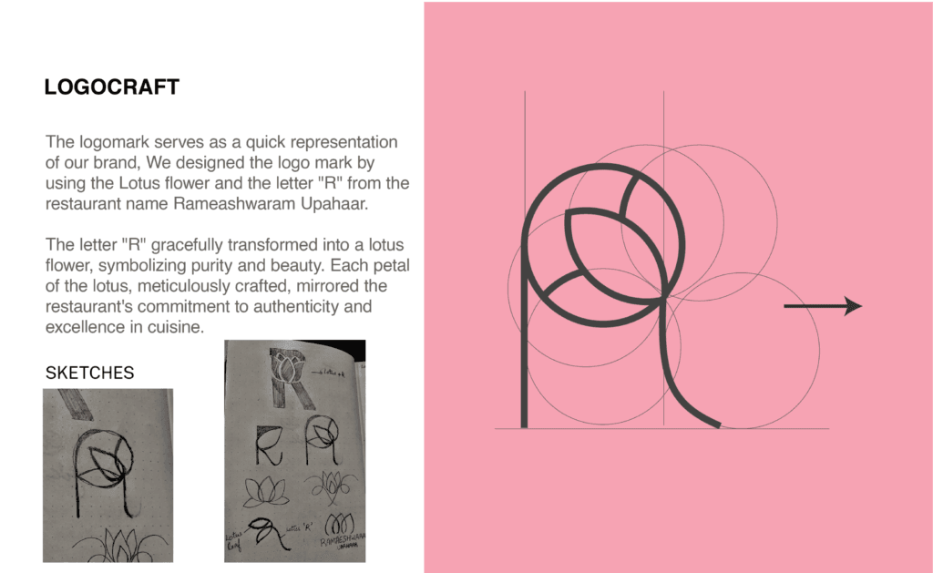
Before opening any design software, our team sat down with paper and pencil. We produced a set of handmade rough sketches exploring letterforms, icons, a South Indian motif, and the feeling of a temple-town restaurant and shortlisted directions by hand.
Sketching first keeps a mark honest. It forces the concept to work as a plain drawing before colour, gradient or a fashionable typeface can dress it up. If an idea holds attention in pencil, it will hold up as a finished logo. Those rough sketches became the foundation for the final mark, and we handed them back to the client as part of the brand story, a record of how the identity was actually made, by hand, and not pulled from a template.
The logo: a mark rooted in tradition
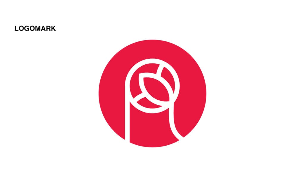
From the shortlisted sketches we developed the final logo design for Ramaeshwaram Upahaar. The mark carries a warm, traditional character that reflects South Indian heritage, and it stays legible whether it is shrunk to a 40-pixel avatar on Zomato and Swiggy or blown up to a six-foot façade board.
A restaurant logo has to survive in more places than most. It sits on the menu, on staff aprons, on takeaway packaging, on social media, and on the signage outside. We designed the mark to hold its shape and its meaning across every one of those sizes and surfaces, so the brand looks the same to a guest scrolling a food app and to a passer-by on the street in Lanka.
Brand guidelines: so the brand stays consistent
A logo on its own tends to drift. The moment a restaurant hands work to a printer, a signage vendor or a social-media freelancer, colours shift and spacing slips. To prevent that, we delivered a set of brand guidelines covering the logo, the colour palette, typography and clear usage rules.
The guidelines are the reason every future menu reprint, festival banner and Instagram post looks like it belongs to the same restaurant. For an independent kitchen competing with chains, that consistency is a large part of how a brand starts to feel established.
Menu card design: the one piece of design a guest holds
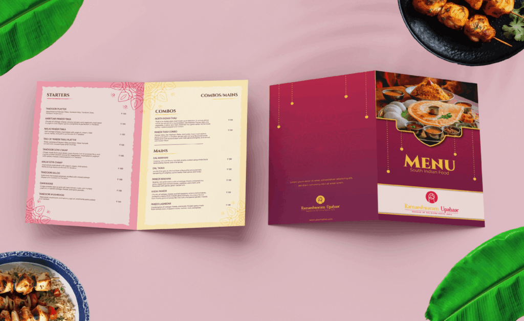
The menu is the single piece of print design a guest holds in their hands for several minutes. We designed the menu card to be easy to scan, with the South Indian and North Indian sections grouped clearly and the signature dishes easy to find.
Good menu design is quietly commercial. Clear hierarchy, comfortable spacing and a sensible reading order help guests decide faster and notice the dishes the restaurant most wants to sell. We kept the layout clean and appetising, in step with the logo and the wider identity.
The exterior main board and in-space branding
On a street lined with restaurants, the exterior main board is the first and sometimes the only chance to be noticed. We designed the façade board so the Ramaeshwaram Upahaar name reads cleanly from a distance and stays legible after dark, when much of the footfall in Lanka happens.
Inside, the in-space branding carries the identity from the pavement to the table. Wall graphics and brand cues turn a room into a recognisable space, so the experience a guest sees on the board outside matches the one they sit in. The exterior draws people in; the interior confirms they are in the right place.
Signage and the complete corporate identity
Alongside the main board, we produced the supporting signage and banners that complete the corporate identity. Wayfinding and counter signage, festival and offer banners, and delivery-platform creatives all draw from the same logo, colours and typography, so nothing looks bolted on.
The result is a single, joined-up brand for Ramaeshwaram Upahaar from the first pencil sketch to the board on the main road. You can see the finished identity on the full Ramaeshwaram Upahaar project page.
Why full restaurant branding is worth it
For an independent restaurant, branding is not decoration, it is how strangers decide to trust you. When the logo, menu, signage and delivery-app creatives all look like they came from the same place, the restaurant reads as settled and dependable, and it stands apart from the eatery next door that changed its board twice this year.
Consistent branding also compounds. Every banner, every reprint and every post reinforces the same mark, so recognition builds over time instead of resetting each season. That is the practical case for doing the whole identity properly, once, rather than patching it together piece by piece.
Frequently Asked Questions
Who designed the branding for Ramaeshwaram Upahaar?
Creative Orion, a branding and design agency based in Faridabad, designed the complete brand identity for Ramaeshwaram Upahaar in Varanasi including the logo, brand guidelines, menu card, banners, exterior main board, in-space branding and signage.
What does restaurant branding include?
Restaurant branding usually includes the logo, a colour palette and typography set out in brand guidelines, the menu card, the exterior main board and signage, in-space branding inside the restaurant, and creatives for delivery platforms like Zomato and Swiggy.
Why did you start the logo with handmade sketches?
Hand-drawn sketches test a concept before colour or a typeface can dress it up. If a mark works as a simple pencil drawing, it will work as a logo. For Ramaeshwaram Upahaar we shortlisted directions on paper first, then developed the final logo from the strongest sketch.
How much does restaurant branding cost in India?
At Creative Orion, logo design packages start from ₹20,000. A full restaurant branding project covering logo, guidelines, menu, signage and in-space branding is quoted by scope, because the number of print items and signage pieces varies from one restaurant to another.
Does Creative Orion design branding for restaurants outside Delhi NCR?
Yes. Creative Orion works with clients across India. The Ramaeshwaram Upahaar identity was delivered for a restaurant in Lanka, Varanasi.
Where is Ramaeshwaram Upahaar located?
Ramaeshwaram Upahaar is at B31/82, Rashmi Nagar Colony, near V2 Mall, Lanka, Varanasi, Uttar Pradesh, close to Banaras Hindu University.