Creative Orion is a branding and website design agency in India with physical offices in Faridabad, Gurgaon and Delhi, serving clients across Delhi NCR and PAN India. In 2026 we designed the brand identity for La Maison Luxé, a luxury salon in Greater Noida positioned as the house of luxury grooming: the monogram and wordmark, the logo variation set, the colour and typography systems, corporate identity, application design and a full brand style guide.
The salon runs three service verticals hair artistry, skin care and nail architecture and had no founder story to build on. The brand was constructed rather than narrated, and that decision shaped every choice that followed.
Brand foundations (mission, service verticals, tone of voice), monogram and logotype design, logo variation set, clearance and misuse rules, colour system, typography system, corporate identity, application design, brand style guide
Positioning line
The House of Luxury Grooming
Agency
Creative Orion, a unit of Young IT Minds Pvt. Ltd.
A brief with no origin story, and we did not invent one
Branding sells stories, so agencies tend to find one whether or not it exists. Somebody’s grandmother, a childhood memory, a word in a language nobody in the room speaks. It is a reliable way to fill a presentation and a poor way to build a business asset, because a story invented in a deck has to be maintained by people who did not believe it in the first place.
La Maison Luxé came to us without one. It is a new luxury salon in Greater Noida, offering high-end skin, hair and nail services, built on modern elegance and personalised consultation. The founder’s ambition was a specific standard of experience, not a narrative.
So the work went into structure instead. If the brand cannot lean on a story to feel distinctive, every distinguishing quality has to be produced by the design itself: how the mark is built, how tightly the system is specified, how consistently it holds across surfaces. That is a more demanding brief, not a lesser one. There is nowhere to hide. The other constraint was the name. La Maison Luxé is French, it is elegant, and it does not tell a passer-by in Greater Noida what the business does. That problem gets solved later on this page, in the logo variations, and it is the most practical decision on the whole project.
The house of luxury grooming, and what a house has to contain
The positioning line came first: the house of luxury grooming. It is doing two jobs. It reads back to the name, which means house, so the brand line and the brand name reinforce each other instead of competing. And the word house sets an expectation of range a house holds more than one thing under one roof, which is exactly what this salon is.
The mission is stated plainly in the guidelines: high-end services and an exclusive experience for every client. Underneath it sit three verticals, each named rather than listed, because naming a service group turns a price-list category into part of the brand.
Vertical
What it covers
Hair Artistry
Hair cuts, colouring, hair spa and scalp treatments
Skin Care
Facials, cleanups, waxing and body rituals including manicures and pedicures
Nail Architecture
Extensions, gel overlays and spa manicures
Nail architecture is the one worth pointing at. The industry-standard phrase is nail art, which sets an expectation of decoration. Architecture sets an expectation of construction, precision and structure and it supports a higher price for the same appointment. Naming is one of the cheapest levers a salon has and one of the least used.
Tone of voice
Professional, calm and sophisticated. Simple but elegant language, focused on expert care, so that a client feels valued and unhurried rather than sold to. Documented in the guidelines for the same reason every salon needs it documented: the voice is produced daily by a receptionist, a stylist and whoever runs the Instagram account, and without a written standard those are three different brands.
One letter hidden inside another
With no story to carry the identity, the mark had to do the work. It is a monogram, and it is built on three decisions.
Thoughtful details that make the identity memorable
01
The L lives in the negative space of the M
The L is not placed beside the M or overlapped on top of it.
It is tucked into the negative space of the M’s first leg,
so the two letters occupy one form rather than two.
The practical benefit is that the mark reads as a single
object at small sizes an app icon, an embroidered towel,
a stamped foil on a card where interlocking monograms
usually collapse into a smudge.
The strategic benefit is that a monogram somebody has to
look at twice is a monogram they remember.
02
The circle closes it
The monogram sits inside a thin, precise circle. The
thinness is the decision. A heavy containing ring reads
as a badge or a seal and pulls the brand towards heritage;
a hairline ring reads as restraint and precision, which is
where a contemporary luxury salon needs to sit.
The circle also gives the identity a fixed, self-contained
icon that can be lifted out of the full lockup and used
alone on a shop wall, a towel band, a social avatar, a
loyalty card.
03
The wordmark is deliberately quiet
LA MAISON is set as the primary line in a customised
high-contrast serif, with Luxé placed beneath it at a
smaller weight.
The hierarchy is not decorative. It makes the name
legible in the sequence a person actually reads it,
and it keeps the accented word the part that carries
the elegance as a deliberate second beat rather than
competing with the first.
The typographic treatment is minimal throughout,
because in this category ornament reads as effort,
and effort reads as trying too hard.
01MONOGRAM
02APPLICATION
03IDENTITY
When your name does not say what you sell
La Maison Luxé sounds like a boutique, a patisserie, a furniture showroom or a perfume. It does not say salon. For a brand that will mostly be encountered as a board above a door in Greater Noida, that is a commercial problem, not a linguistic one.
The fix is built into the variation set rather than into the name. The identity ships in five forms:
Primary logo — monogram above the stacked wordmark. Used where the brand is already known or where context makes the category obvious.
Primary logo with SALON — the same lockup with the category word set beneath. This is the version for shopfront signage, maps listings, directory entries and anywhere a first-time viewer needs to know what the business is.
Horizontal logo with SALON — the same information in a wide format, for fascia boards, website headers, email signatures and any surface wider than it is tall.
Wordmark — the name alone, as the secondary logo, for use where the monogram already appears elsewhere in the layout.
Icon — the circled monogram alone, for avatars, app tiles, towel bands, embroidery and small-format print.
The instinct with a name this elegant is to protect it and never let the word SALON near it. That instinct costs walk-ins. A luxury brand can afford to be understated everywhere except on the surface that tells a stranger what building they are standing in front of.
Clearance rules are specified against the mark’s own proportions, using the monogram as the unit, so the spacing survives being scaled by whoever applies it. Six misuse rules are documented with visual examples: no colour combinations that render the logomark illegible, no different colours for the logotype and the symbol, no disproportionate stretching or warping, no outlines, drop shadows, bevels or other effects, no scaling or repositioning of elements inside the lockup, and no placing the logo over photography that swallows it.
Green and gold, because black and gold was taken
Role
HEX
RGB
Where it works
Primary deep green
#214F3E
33, 79, 62
Logo, signage, packaging, brand backgrounds
Primary gold
#907548
144, 117, 72
Accent and call-to-action colour
Secondary cream
#FCF1D6
252, 241, 214
Backgrounds, print stock, reversed lockups
Black and white
#000000 / #FFFFFF
0,0,0 / 255,255,255
Utility and single-colour reproduction
Four typefaces, and one of them never appears in a sentence
Typeface
Role
Used for
Bluemun (customised)
Logo font
The wordmark only. Never used for general setting
Modern Muse
Primary font (1)
Headings and subheadings, highlighted words, website and digital assets
Aptos Serif
Primary font (2)
Headings and subheadings, marketing material, environmental design, website
Jost
Secondary font
Body text, service menus, business cards, digital assets
Where the system was taken next
The embossed mark
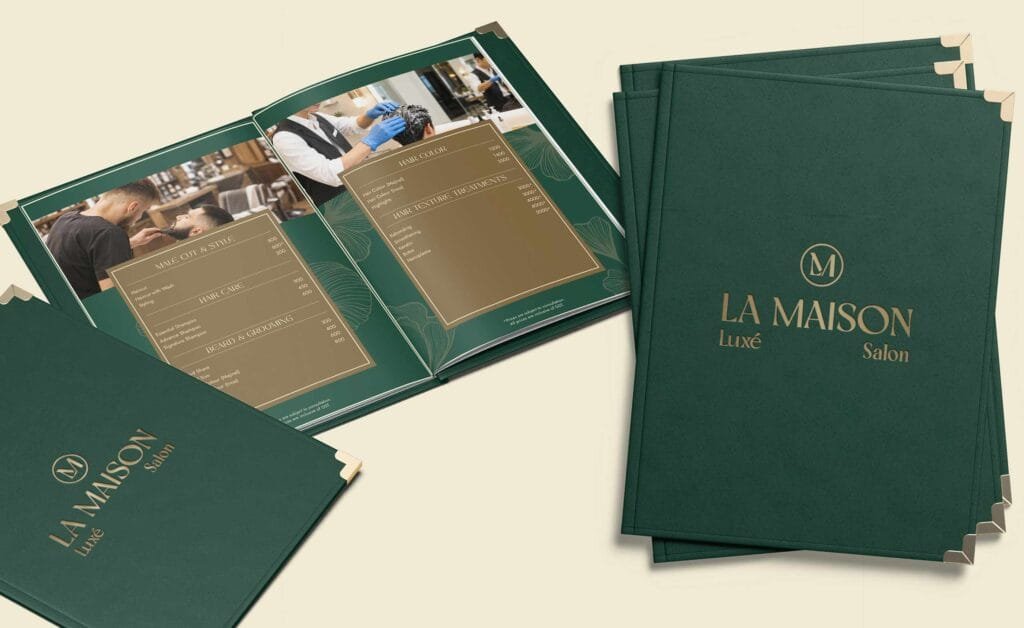
The monogram rendered as a blind emboss in gold on textured stock no colour fill, just relief. It is the clearest statement of the brand’s position: a mark confident enough to be visible through shadow alone. It is also a specification, not a mood image; it tells a vendor that the icon is built to survive being reproduced without ink.
Corporate identity
Business cards in a two-sided treatment deep green with the gold lockup on one face, cream with green type on the reverse, carrying name, designation, phone, email and address. The system extends to the standard stationery set and the client-facing print a salon lives on: service menus, price lists and appointment cards, where Jost does the work.
Take-home and retail
Towel bands and tote bags in the brand green with the gold and white lockups. A towel band is a small print job and one of the highest-return brand surfaces a salon owns, because it is the object a client photographs without being asked to.
Outdoor
Large-format layouts built around the line: a space where beauty, grooming and indulgence come together. Outdoor is where a restrained palette earns its keep deep green holds at distance and in poor light, where a pale luxury palette washes out entirely.
What the client actually holds at the end
All of it is documented in a brand style guide: brand foundations, mission and service verticals, tone of voice, monogram construction and rationale, the five logo variations, clearance, six misuse rules, the full colour system in CMYK, RGB and HEX, and the four typefaces with their assigned roles.
For a brand with no origin story to lean on, the guide is not supporting documentation it is the brand. Consistency is the only thing producing the sense of a considered, expensive business, and consistency after handover is a documentation problem, not a design one. A signage fabricator, a printer and a social media freelancer will each apply this identity without ever speaking to us. The guide is what makes their three outputs look like one salon.
The same category, one year apart, with nothing in common
We designed Maila Salon in Bangalore in 2025 and La Maison Luxé in Greater Noida in 2026. Both are premium salons. Both received a full identity system from the same studio, in consecutive years. Put them side by side and they share nothing.
Maila Salon (2025)
La Maison Luxé (2026)
Built on
A family story the founder’s late father
Structure no origin story, by choice
Mark
Wordmark with a red dot as the emotional signature
Interlocking L and M monogram inside a thin circle
Palette
Maroon, cream, accent red
Deep forest green, gold, cream
Tone
Warm, elegant, trustworthy heartfelt
Professional, calm, sophisticated composed
Type
Five typefaces including an expressive script
Four typefaces, no script, minimal treatment
Strategy
Make the story visible in the mark
Make the system so precise it needs no story
This is the answer to the only question that matters when a salon owner shortlists an agency: will my brand look like your last client’s. If an agency has a house style, one of its clients is always wearing somebody else’s identity.
Get started
Planning a salon brand?
Tell us where the salon is, what stage it is at and what is already built. We will tell you honestly whether you need a full identity, a partial refresh, or better application of what you already have.
We create brands that communicate and connect with people to inspire them. We specialize in various creative and sustainable branding solutions such as Digital Marketing, Corporate Identity Design, Website Designing, and many more.