Gramin Roots is a homemade pickle brand from Mathura, Uttar Pradesh, made by women from rural India with no preservatives, added flavours or chemicals. Creative Orion, a branding agency in Faridabad, designed its logo, colour palette, packaging for three achaars, a standee and marketing canopies.
The brief
Gramin Roots wants to revive traditional pickles from rural India and give women fair, paid work. The founder asked for a logo that felt fresh, not just the name in a decorative font, in colours drawn from rural life and farm crops. The brand is for people from North India who now live in cities and miss the taste of home.
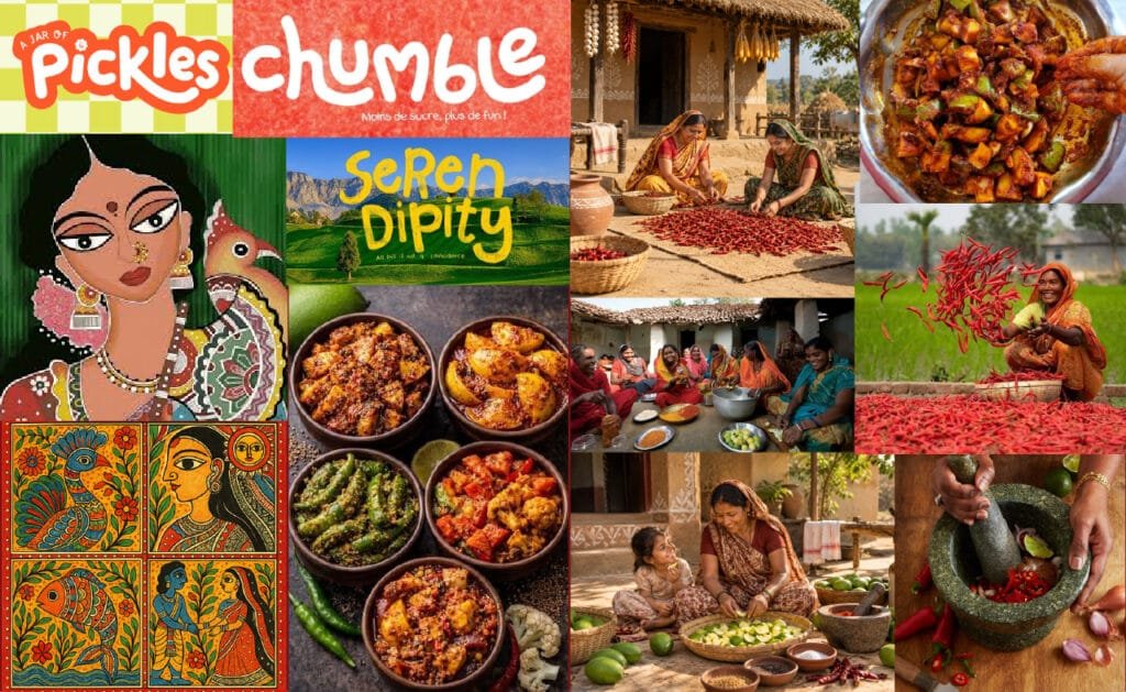
Moodboard Direction
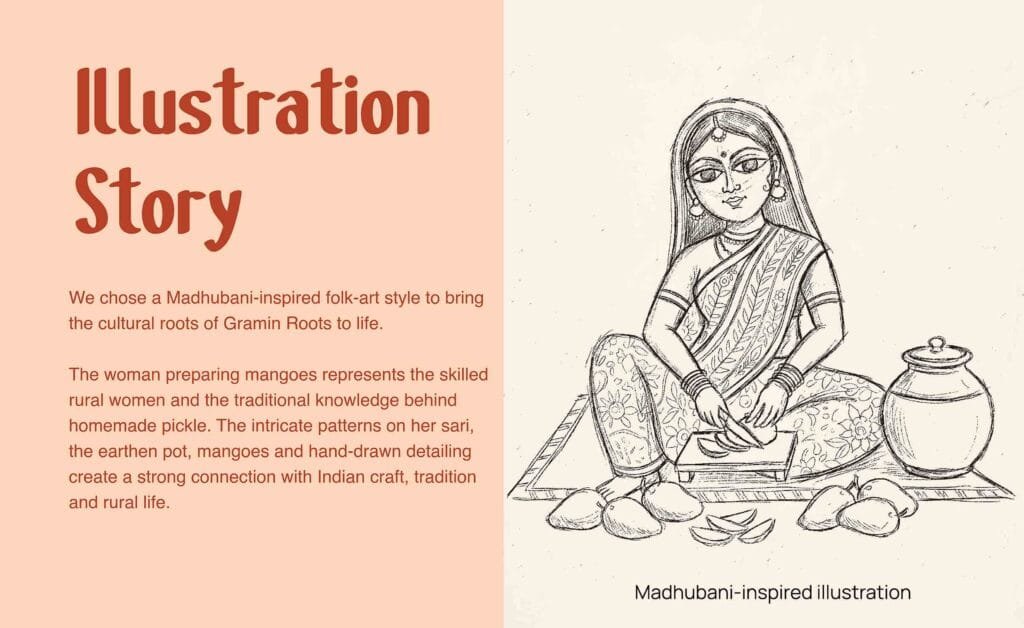
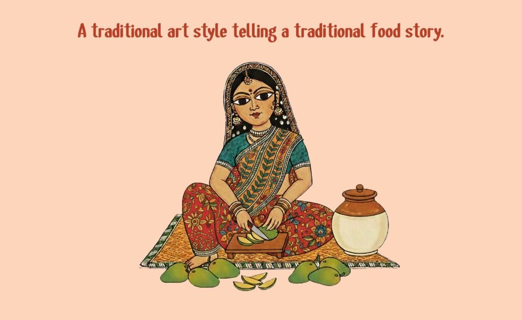
The moodboard explores the rich cultural roots of Indian pickle-making, combining vibrant folk-art references with authentic rural life. Hand-drawn Madhubani-inspired patterns, traditional Indian women, village homes, earthy textures, fresh ingredients, and colourful spices create a warm, handcrafted visual world. The imagery captures community, tradition, nostalgia, and homemade goodness, while the bold typography references bring a contemporary, approachable energy. Together, these elements establish a visual direction that feels rooted in India, human, vibrant, nostalgic, and authentically homemade.
1. Logo sketches
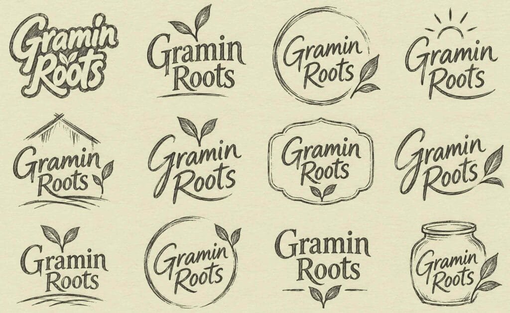
We started on paper. We explored several rough concepts around the ideas of rural roots, crops and homemade food, then shortlisted and finalised one direction with the client.
2. Vector logo
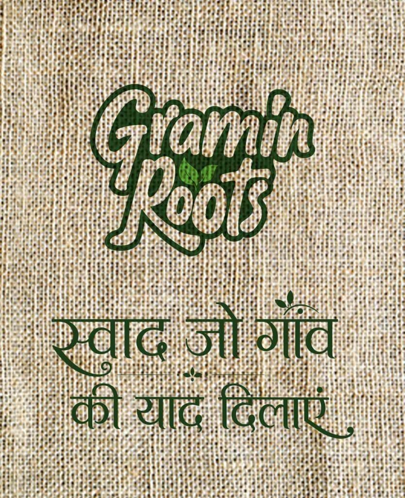
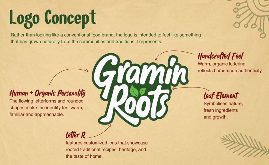
The chosen sketch was built into a clean vector logo that works at every size, from a jar label to a large canopy. It pairs the Gramin Roots name with a leaf symbol, so the brand is recognisable even before the name is read.
3. Colour palette
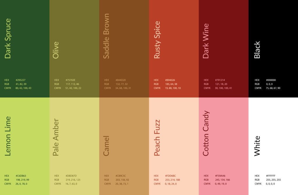
Following the founder’s direction, the palette takes its colours from rural life and agricultural crops. It is used across the logo, labels, standee and canopy to keep the brand consistent.
4. Packaging for three achaars
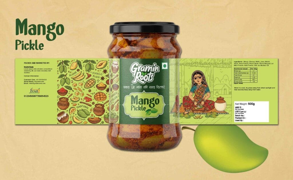
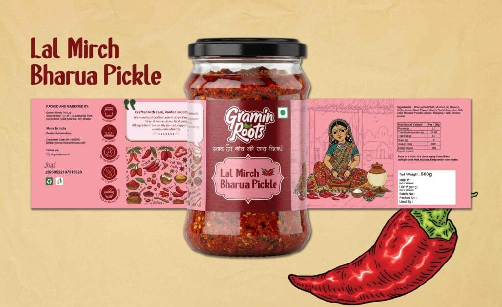
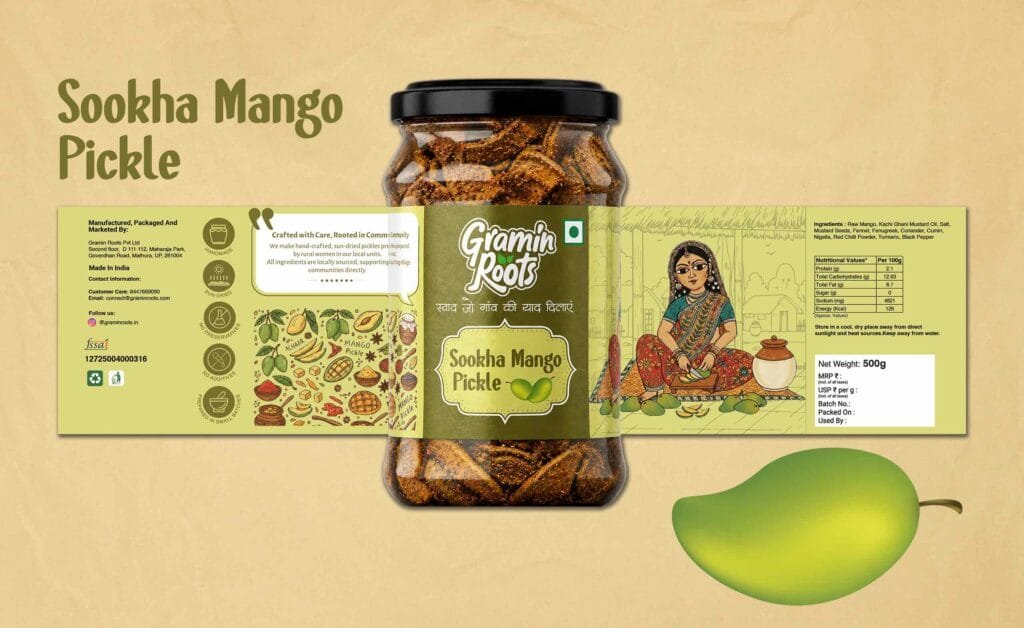
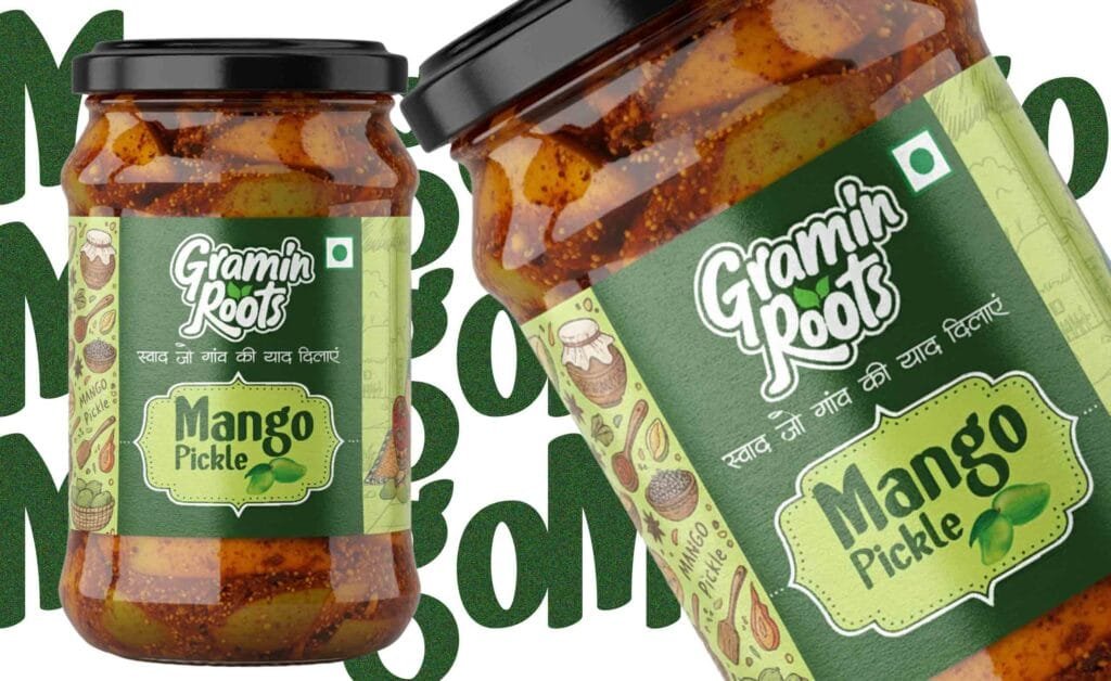
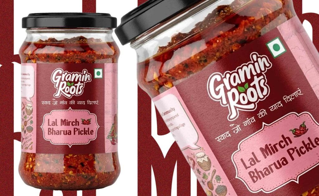
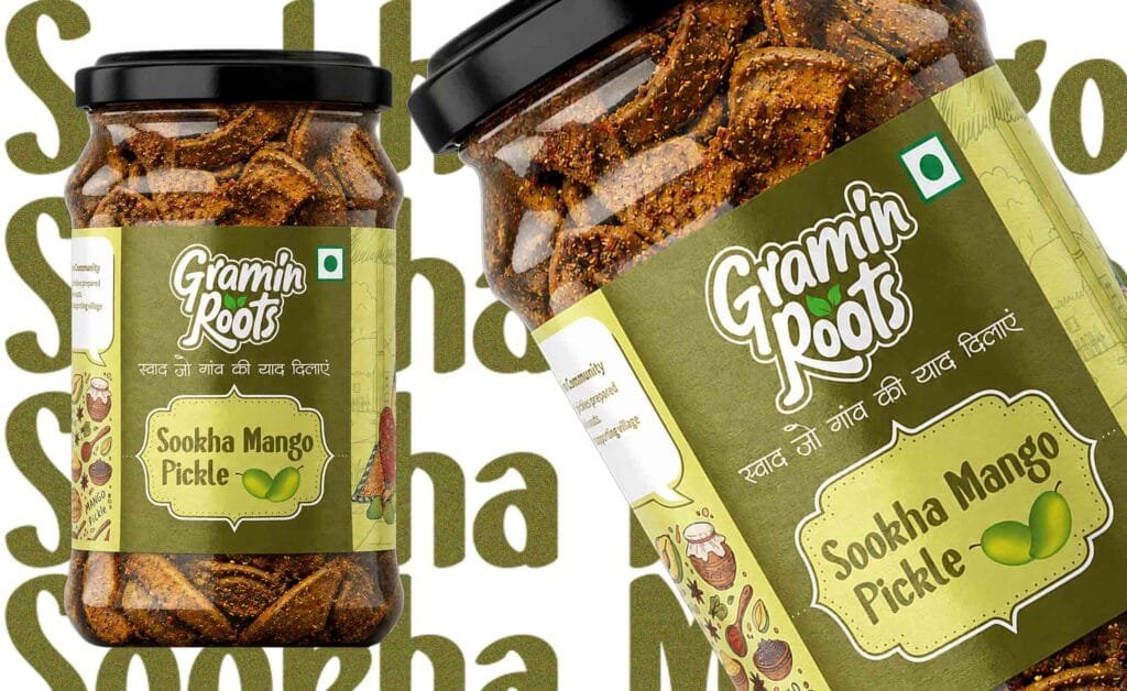
We designed glass-jar labels for Aam Ka Achaar, Lal Mirch Bharua Achaar and Meetha Aam Achaar. Each label leads with the Hindi name, followed by an English descriptor and the key promise: no preservatives, no added flavours, no chemicals. The layout is the same on all three jars, so the range reads as one family while each pickle stays easy to tell apart.
5. Business card
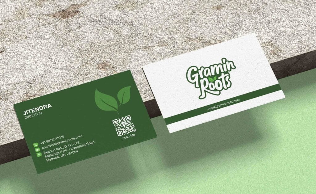
The business card carries the logo, colours and leaf symbol in a compact format, giving the founder a professional, on-brand card for meetings with retailers, distributors and partners
6. Standee
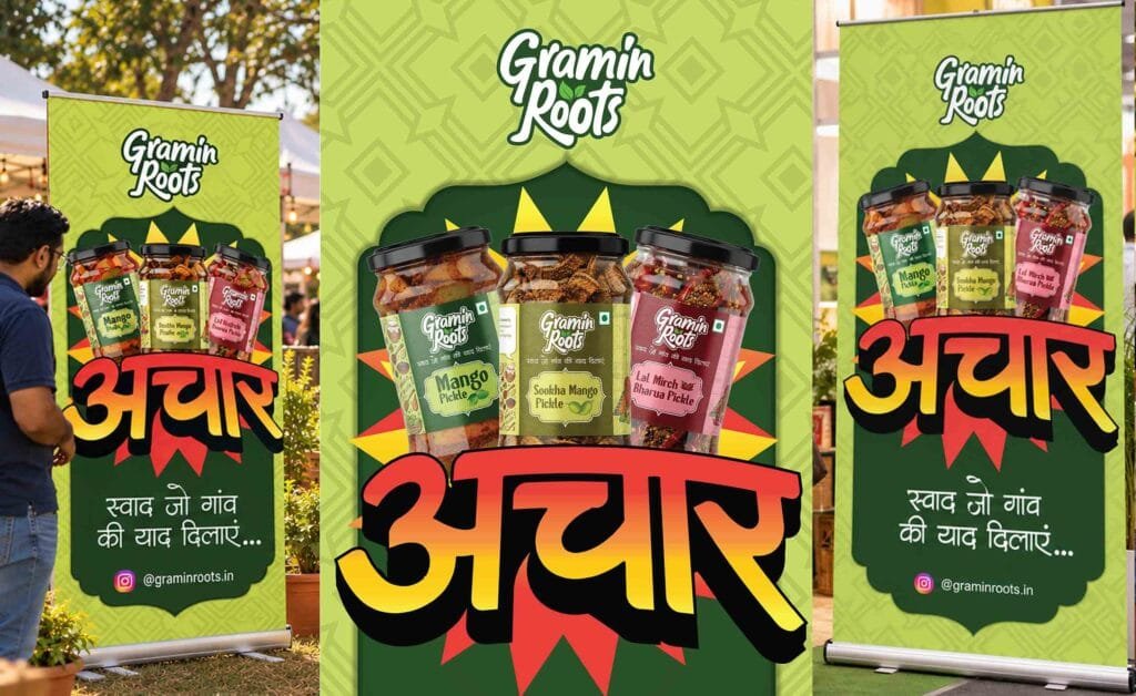
A standee for retail counters, exhibitions and events introduces the brand and its homemade promise to people seeing it for the first time.
7. Marketing canopies
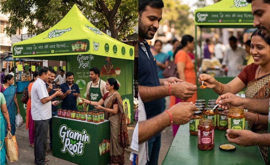
Canopies for food markets and stalls carry the logo and colours at a large scale, so the brand can be spotted from across a busy market.
The result
Gramin Roots now has one consistent identity across its jars, retail displays and market stalls. See the brand at graminroots.com and the full project on Behance. Need packaging for your food brand? Explore our packaging design services.