OpenSky Voyages plans travel for high-income individuals, ultra-high-net-worth clients and corporates: flights, hotels, visas, transfers, tours, cruises and insurance, assembled into itineraries built around one client at a time. Creative Orion redesigned its brand identity from the logo up, built the corporate identity around it, and is now redesigning the website on the same system.
The challenge
A business that had outgrown its logo
OpenSky Voyages was moving from a conventional travel agency to a research-led travel and concierge company. The people it now serves rarely choose on price. They choose the planner they trust with every detail, and they form that view early, from a business card, a folder handed across a table or a homepage opened on a phone.
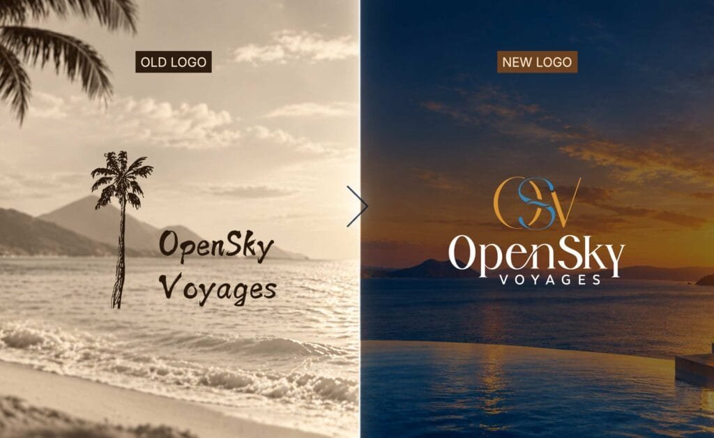
The old identity was built on a literal travel symbol. It told those clients “travel agency” before anyone had a chance to say otherwise, and nothing in it pointed to personal service, expertise or a journey handled end to end.
Minimal, line-based, and a water element for Vastu
The brief set two conditions that pulled against each other. OpenSky wanted a minimal, elegant, line-based identity. It also needed a water element in the logo, a Vastu consideration that was not negotiable. A drawn wave or droplet would have satisfied the requirement and undone the brief, turning the mark back into an illustration of travel. The water had to be present without being pictured.
The solution
Water as structure, not decoration
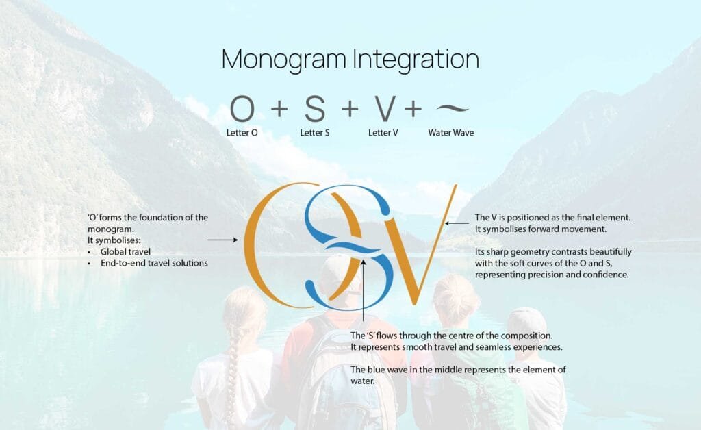
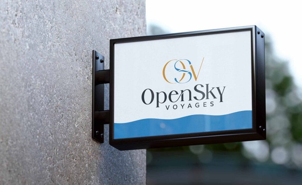
The new mark is a circle drawn in clean lines. Its blue upper segments read as open sky. The lower half is built on an inverted triangle, the classical symbol for water, which meets the Vastu requirement as part of the mark’s geometry rather than as an added motif. Together they cover air and sea travel without an aeroplane or a ship in sight, and the closed circle stands for the journey OpenSky actually sells, handled from first call to return.
A serif that holds at airport scale
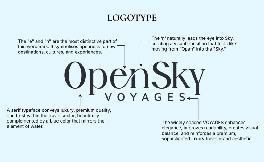
The logotype is a high-contrast serif, with VOYAGES set beneath it in widely tracked capitals. It had to work on a business card and on a placement read from across an airport terminal, and a serif at that size places the company at the premium end of the category before anyone reads a line of copy. The palette is held to blue and orange.
A personality the team can write with
We defined the brand personality as Competence: refined rather than flashy, curated rather than generic, reliable and expert rather than playful. The guidelines show it applied, so the OpenSky team can write in the voice without us in the room.
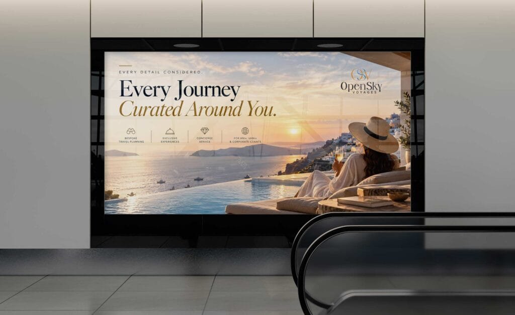
One corporate identity across every touchpoint
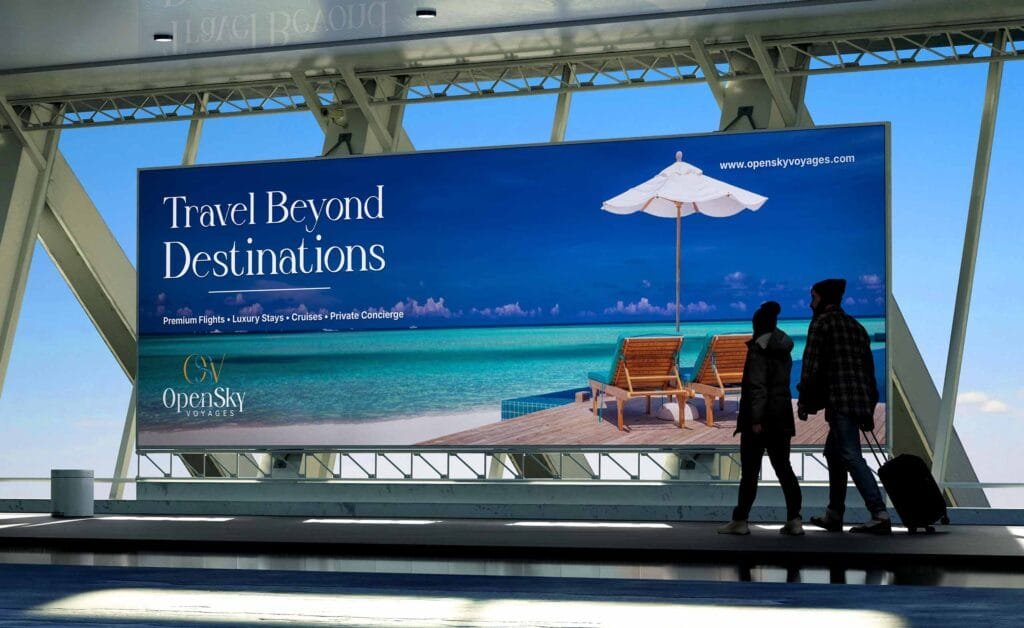
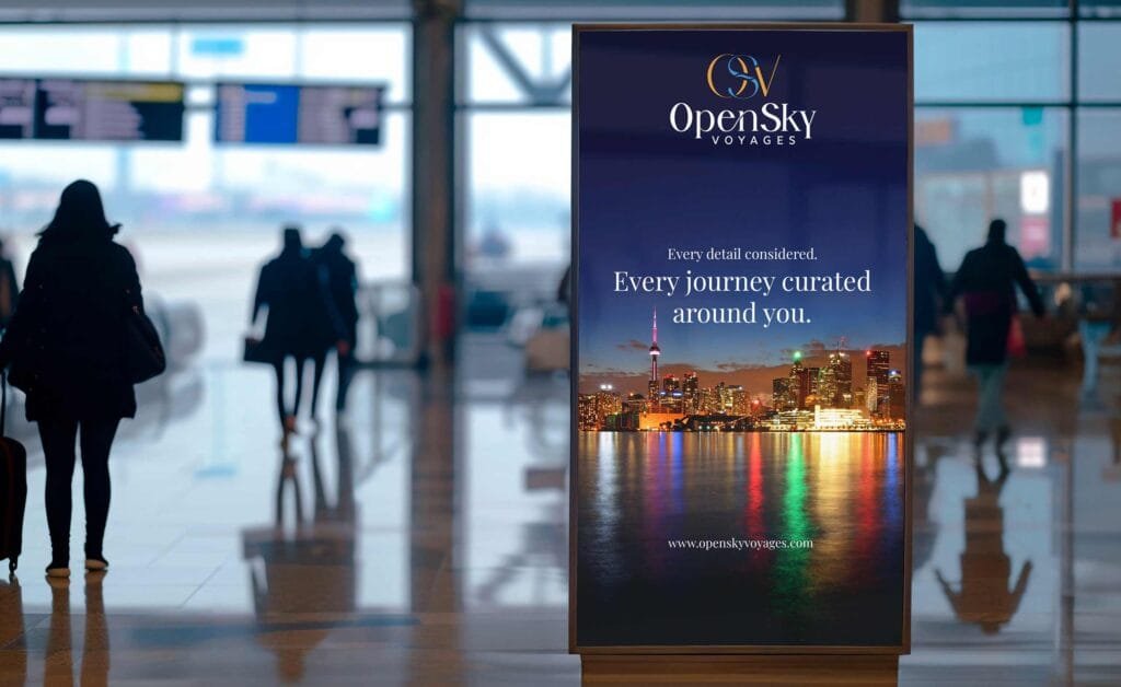
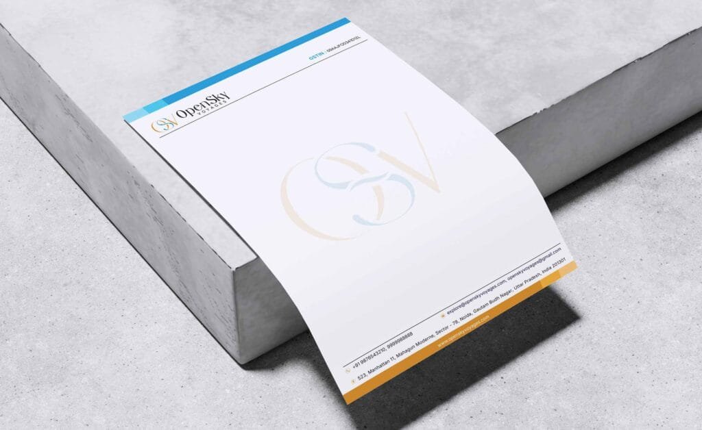
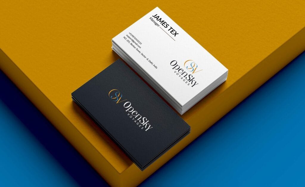
We carried the identity through business stationery, presentation folders, office signage and large-format airport placements, each following the same rules in the brand guidelines. A client meets the same brand at arrivals as on a letterhead.
The website redesign, now in progress
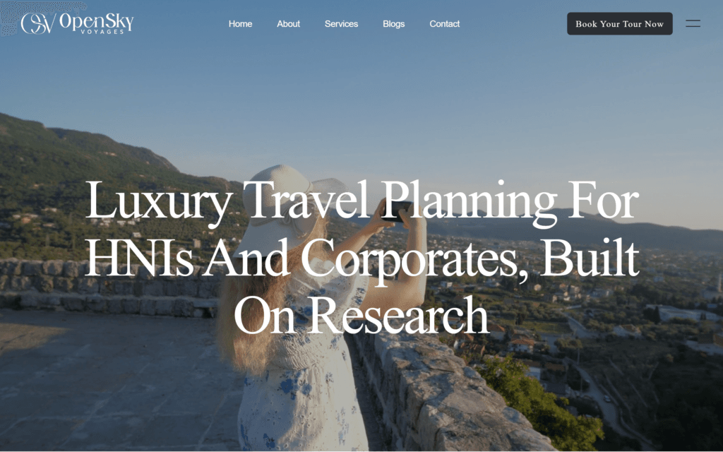
We are redesigning the OpenSky website on the same system: an off-white ground, a video hero and animated tiles that move without competing for attention. The new site runs to around 25 pages, including 20 itinerary pages and a blog, on an architecture built to take search optimisation when OpenSky is ready for it.
What we delivered
Logo redesign, brand personality and tone of voice, colour palette, typography, brand guidelines, business stationery, folders, signage and airport placements. The website redesign is under way. As with every Creative Orion project, OpenSky Voyages owns the finished identity outright, with full copyright transfer and open source files.