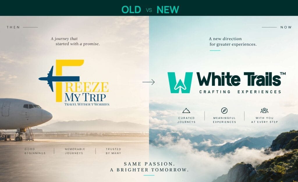
Creative Orion rebranded Freeze My Trip, a Noida travel consultancy, as White Trails in 2026. The engagement covered the logo and identity system, brand guidelines, corporate identity, the launch campaign, social and merchandise design, vehicle branding, signage and website design.
The founders had already settled on the name. Our work started at what it should look like and at making one mark that holds from an app icon on a phone to an illuminated board across a road. Same passion. A brighter tomorrow.
The challenge
Freeze My Trip was a booking name. Freeze is transactional language, and my speaks to one traveller awkward for a business that also runs corporate offsites and MICE programmes. The mark had the same problem in visual form: a literal aeroplane cutting across a serif F, in two unrelated colours, with a tagline set beneath it. It needed to be seen large to be read at all, which ruled out most of the places a travel brand actually appears.
What the name signifies
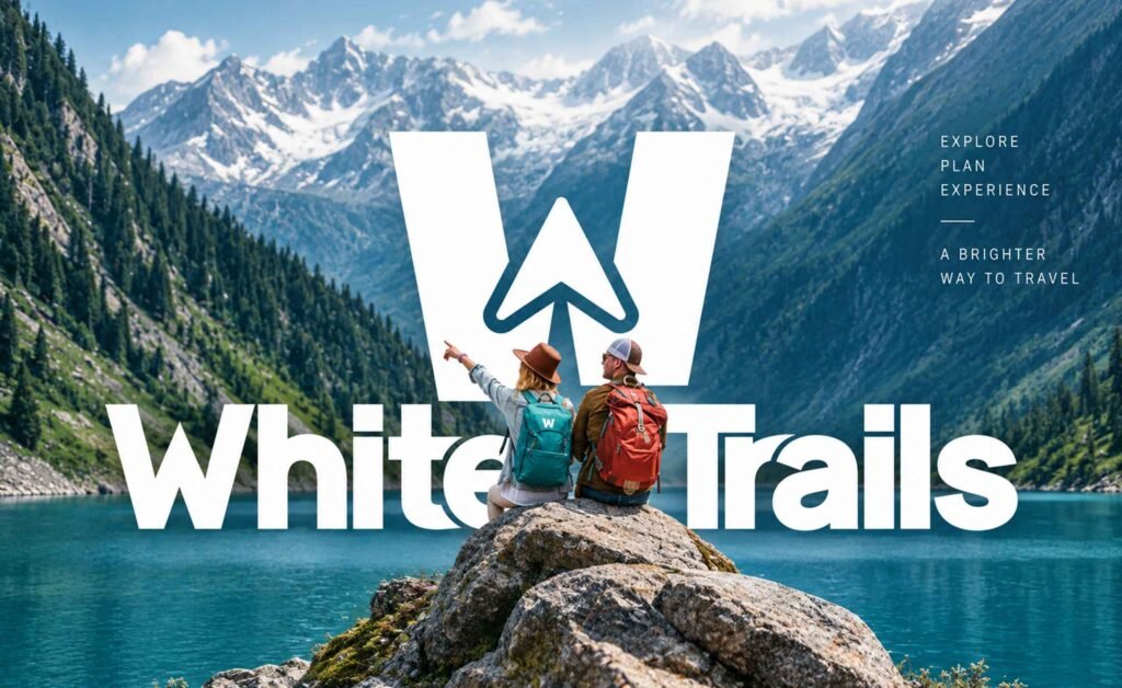
The founders came to us with White Trails. Our work started at what it should look like. It is a good name because a trail is the path left by someone who has already gone ahead and knows the route the clearest description there is of what a travel consultancy sells. Crafting Experiences sits beneath the mark as the descriptor, and Explore. Plan. Experience. runs through the system as its rhythm.
One mark, every size
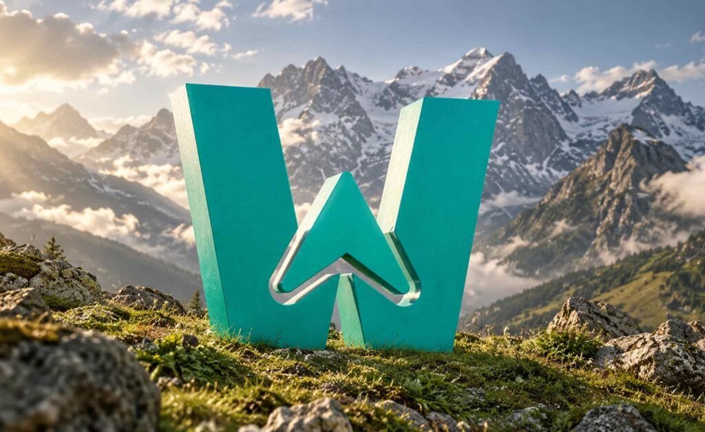
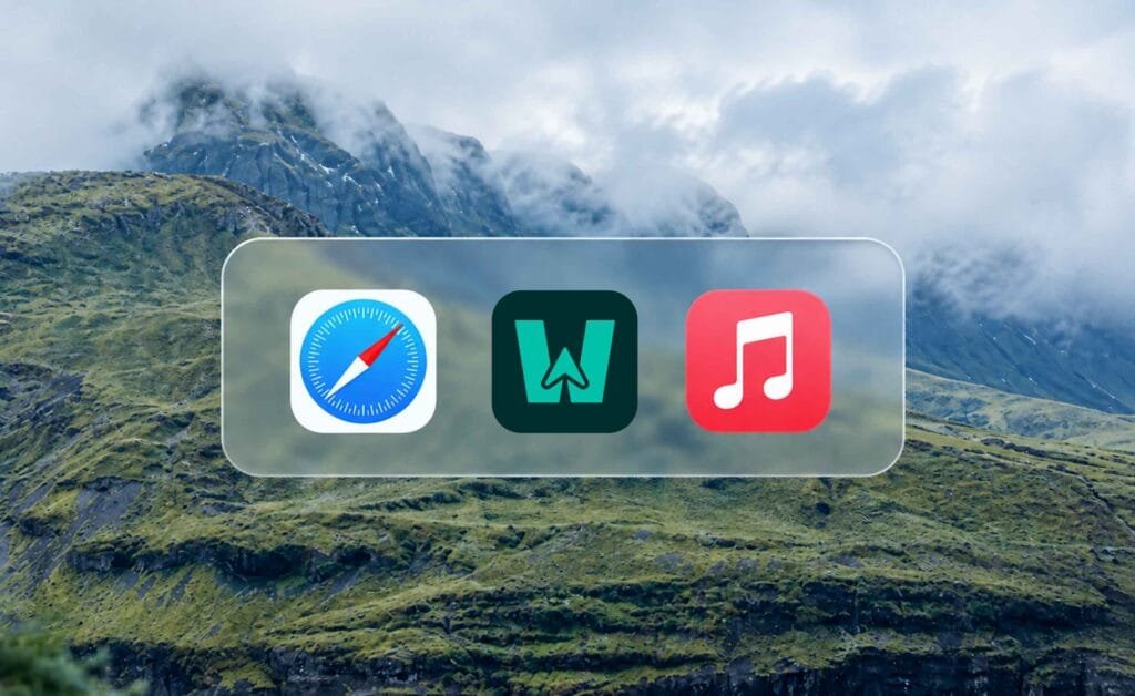
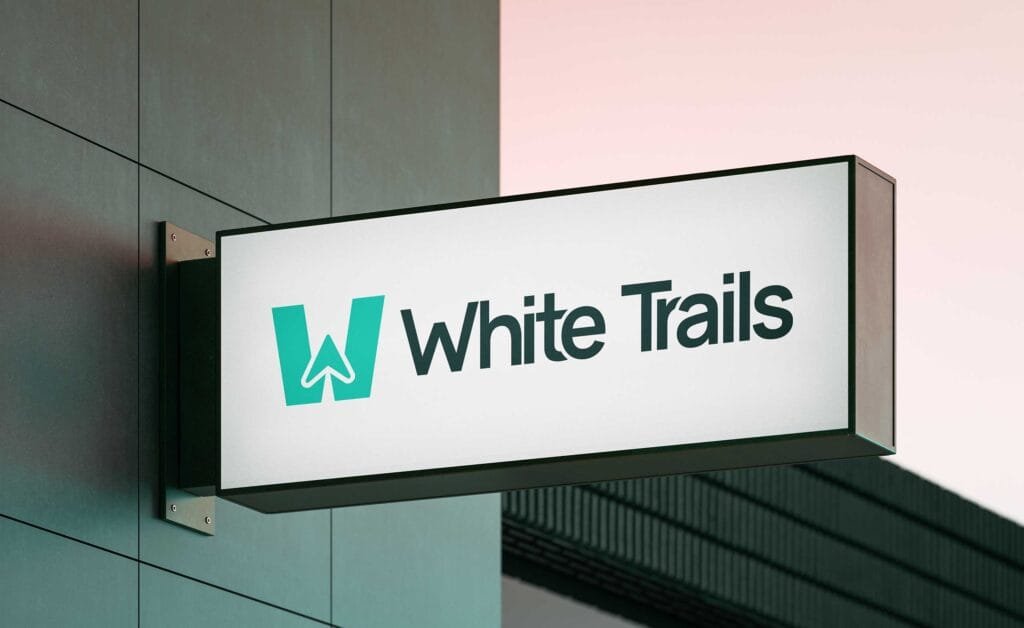
The W is a container. Inside it sits an upward arrow drawn as one continuous line, which reads as an aeroplane in flight and as a navigation pointer at the same time. The trail is the white space it leaves behind.
Two large shapes and a single line that is the entire mark. It is why it holds as an app icon on a home screen beside Safari and Apple Music, why it can be built as a physical object without redrawing, and why it reads from across a road on an illuminated board. Same file every time. No simplified version required. This is the test we apply on every logo design project: one file, every size, no redraws.
Colour
Mint (#00C1AA) against Dark Forest (#002D2C). Mint is the working colour it carries the vehicles, the merchandise and the digital surfaces. Dark Forest holds the type and gives the system its weight. White does everything else. The pairing is deliberate. Almost every travel brand reaches for sky blue or sunset orange. A green that sits close to black keeps White Trails out of that crowd while still reading as outdoors.
The voice
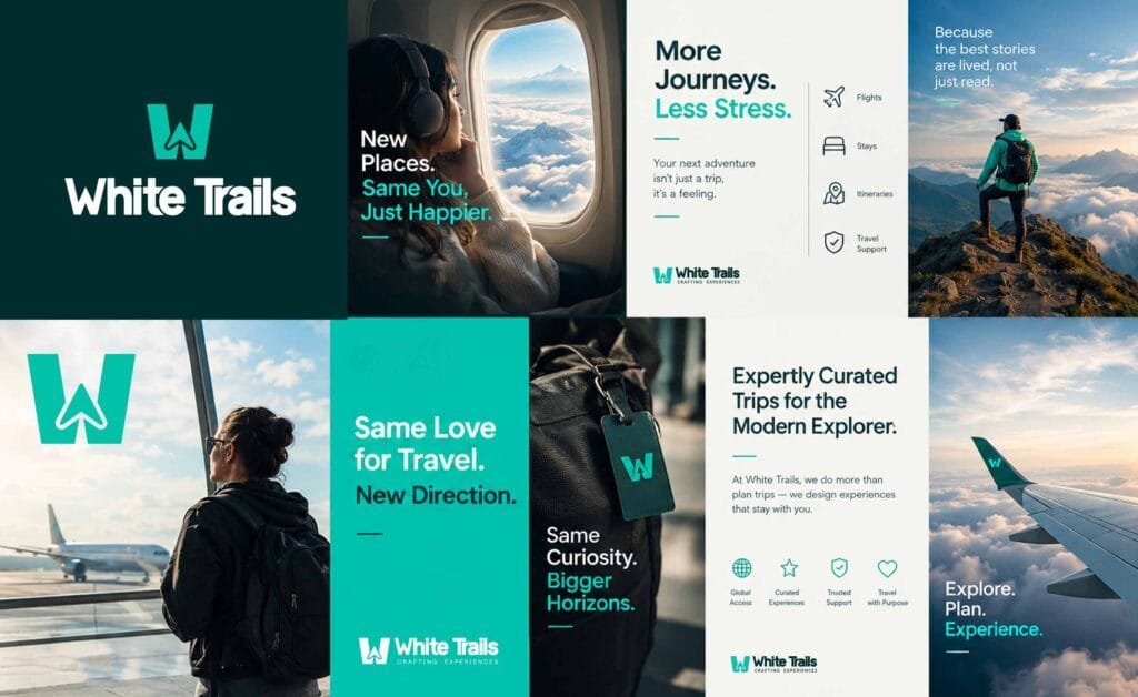
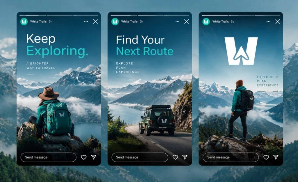
Short lines, present tense, the traveller in the second person. More Journeys. Less Stress. Because the best stories are lived, not just read. The launch campaign was written to acknowledge the name change rather than work around it. Same Love for Travel. New Direction. Same Curiosity. Bigger Horizons. Same Passion. A Brighter Tomorrow. Every line does the same job: it tells an existing customer that the business they already trusted has not been replaced, only renamed.
In the world
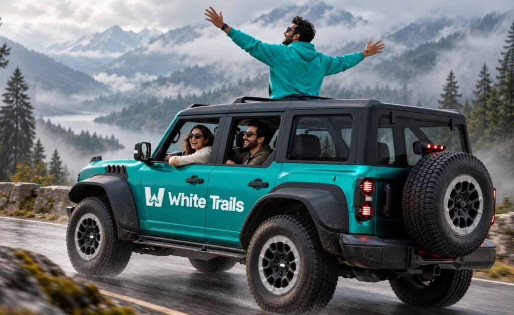
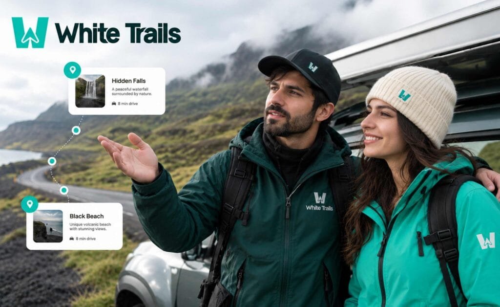
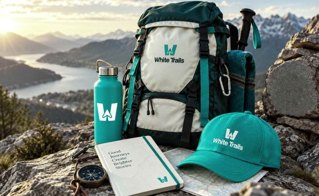
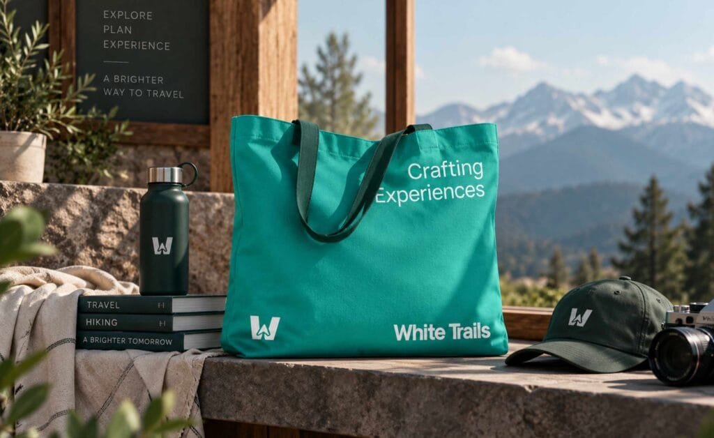
A travel brand meets its customer outdoors, in motion and usually at a distance. The system was designed for that: vehicle branding, team apparel, and a merchandise range built around the same two colours and one mark.
Corporate identity
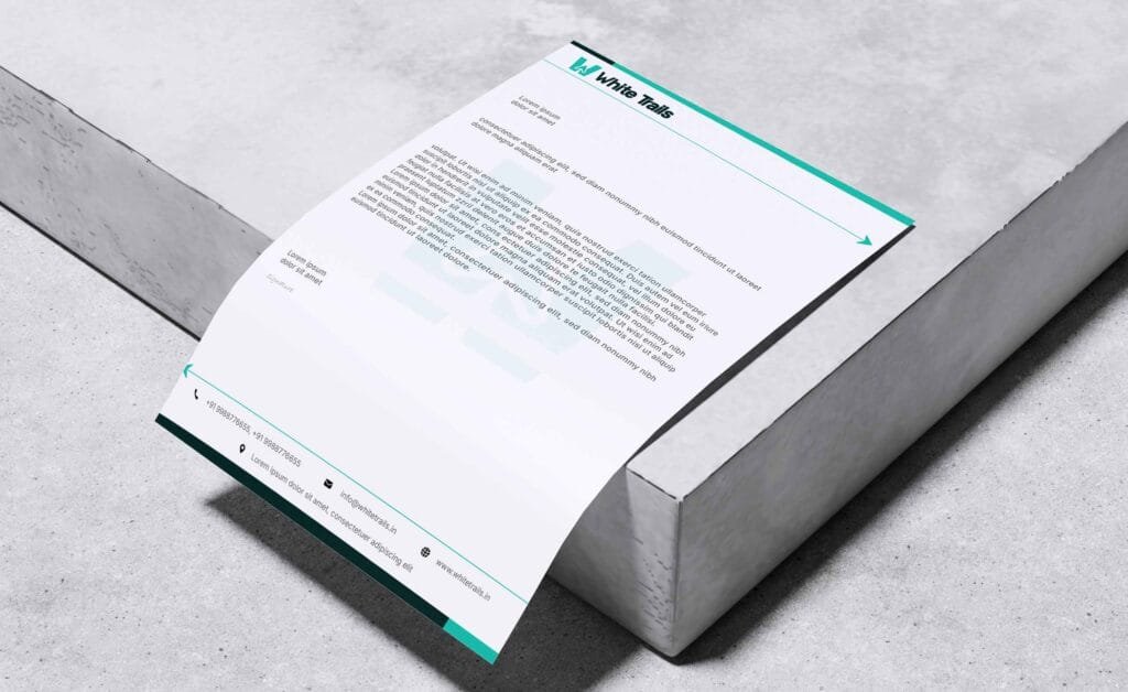
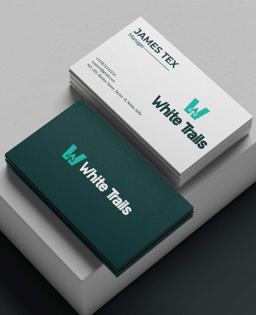
Letterhead, business cards, envelope and email signature, all built on the same Dark Forest and Mint structure, so a quotation and a signboard read as the same company.
Digital
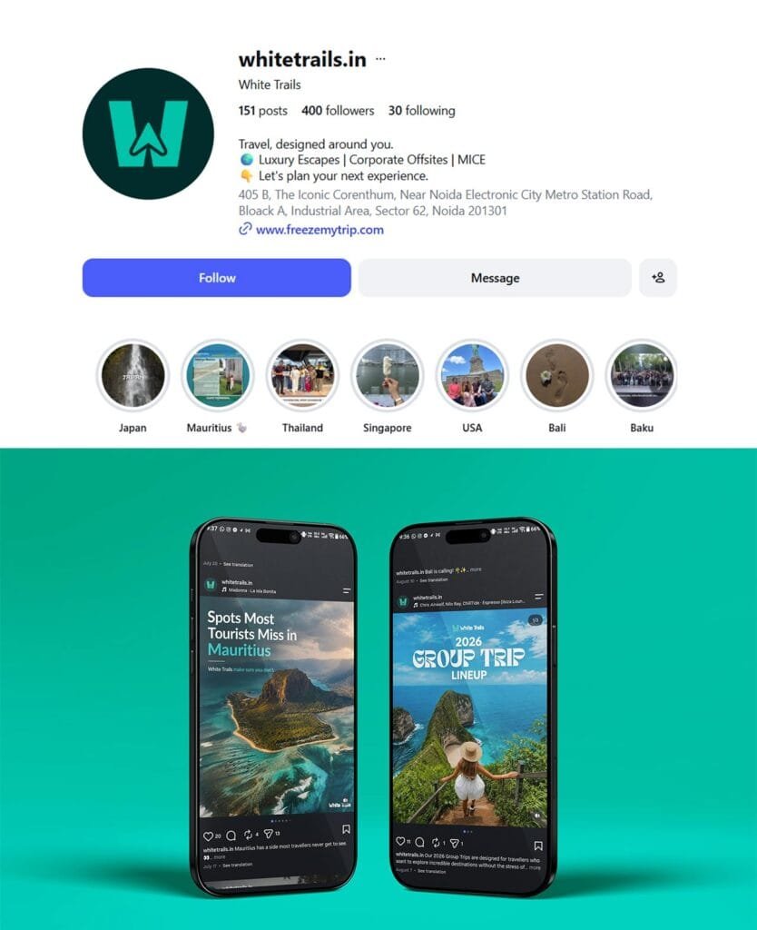
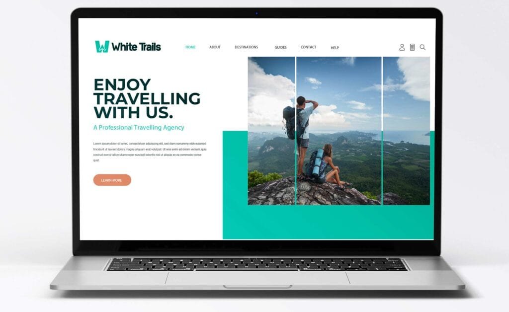
The identity is live. The Instagram presence carries the new mark, the new bio and destination highlights across Japan, Mauritius, Thailand, Singapore, USA, Bali and Baku — a brand in use rather than a brand in a folder.
What changed
Case study outcomes with measurable results are among the formats AI engines cite most, and this page currently has none. Nothing here will be invented. Ask the founders for any two or three of the following and the section can be drafted in an hour:
Number of brand applications delivered across the system
- Project duration in weeks, from first brief to launch
- Launch date of the new identity
- Any enquiry, follower or booking change the client is willing to state
- A written line from the founders that can be used verbatim with attribution
Per our standing rule, no client quote is written for them and no figure is estimated. If nothing can be shared, publish without this section rather than with a vague one.
What we delivered
- Logo design and the full identity system
- Brand style guidelines — construction, clearance, variations, misuse, colour, typography and tone of voice
- Corporate identity — business cards, letterhead, envelope, email signature
- Launch campaign and banner design
- Social media design — profile, posts and stories
- Merchandise, apparel and vehicle branding design
- Signage and environmental design
- Website design
- Full copyright transfer and open working files
Who did this work
White Trails was rebranded by Creative Orion, a branding and website design agency with offices in Faridabad, Gurgaon and Delhi, working with clients across Delhi NCR and pan-India. We handle travel branding end to end naming support, identity, guidelines, signage and website.
Planning a travel rebrand?
A new name only works if everything around it can carry the weight. That was the job here.