Overview
Souvenirr Spaces is a Mumbai-based real estate developer building industrial estates and factories across Kandivali West and the Mumbai Metropolitan Region.
The company approached Creative Orion a brand identity studio based in Faridabad and Gurgaon to build a profession brand identity.
The company entered an industrial real estate market historically dominated by relationship-driven, low-brand-equity players and asked Creative Orion to build the identity that would let them compete for industrialist mindshare on the same cognitive shelf as Lodha, Godrej, and Hiranandani.
We delivered the complete visual identity including the wordmark logo, the colour and type system, the tagline, and the full corporate identity application across stationery, apparel, and outdoor signage.
The brief
The founder came to us with the name. He had a category position, Vastu-driven industrial real estate, built on land acquired, constructed, and sold to factory operators and a clear sense of who he was selling to: 30+ businessmen evaluating manufacturing sites not for mass audiences.
The founder had a clear aspiration, an industrial real estate brand that carried itself. He was very specific on visual identity , need very clean and professional identity. He mentioned to give a brand logo as brand name only could be something like clean and modern but not very sharp edges typography. He mentioned to explore letter mark and combination mark logos as well.
That is the brief we worked against.
What we did
Logo Designing
Multiple logo exploration. We worked on multiple logo concepts, wordmark, letter mark and combination marks.
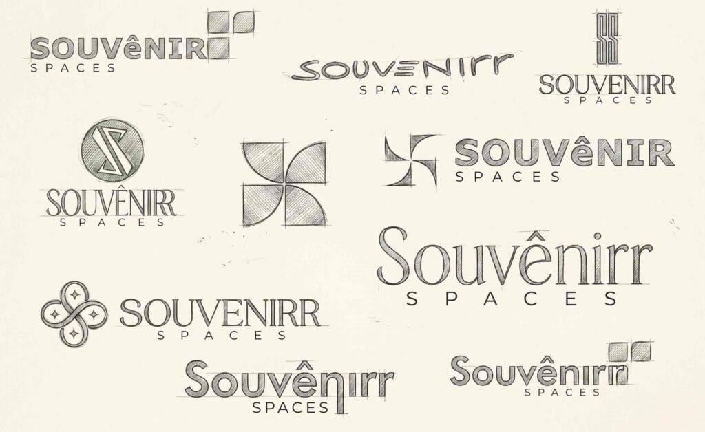
We made that choice of wordmark logo deliberately, same reasoning that runs through our wider logo design work. Every reference brand the founder cited Lodha, Godrej, Tata leads with a wordmark, not a separate icon. In industrial real estate, where the brand often appears on a 40-foot hoarding seen from a highway service road, a clean legible wordmark beats a clever icon every time.
The standout move is the orange chevron sitting where the circumflex would normally appear on the *ê*. *Souvenir* is originally a French word; We designed it into the brand’s primary visual cue an upward pointing chevron that reads as progress, growth, and momentum. Exactly the buyer-state an industrialist wants to feel when committing to a new manufacturing site.
The chevron lives *inside* the wordmark, not beside it. That means the mark scales cleanly from a business card to a hoarding without ever needing to fragment into a separate symbol. A small operational win, but a real one.
Colour
Primary blue carries the wordmark. The choice goes where most institutional real estate brands go, and for the same reasons: trust, stability, longevity. Souvenirr’s blue places it on the right cognitive shelf without copying anyone in the real estate industry.
Orange chevron carries the energy and growth and also the colour of construction safety.
Typography A clean yet modern wordmark form with classical proportions but with enough personality (the elongated *ê*, the soft *S* terminals) to avoid the flatness most real estate developers settle for. It reads as premium without reading as decorative.
Corporate Identity Designing.
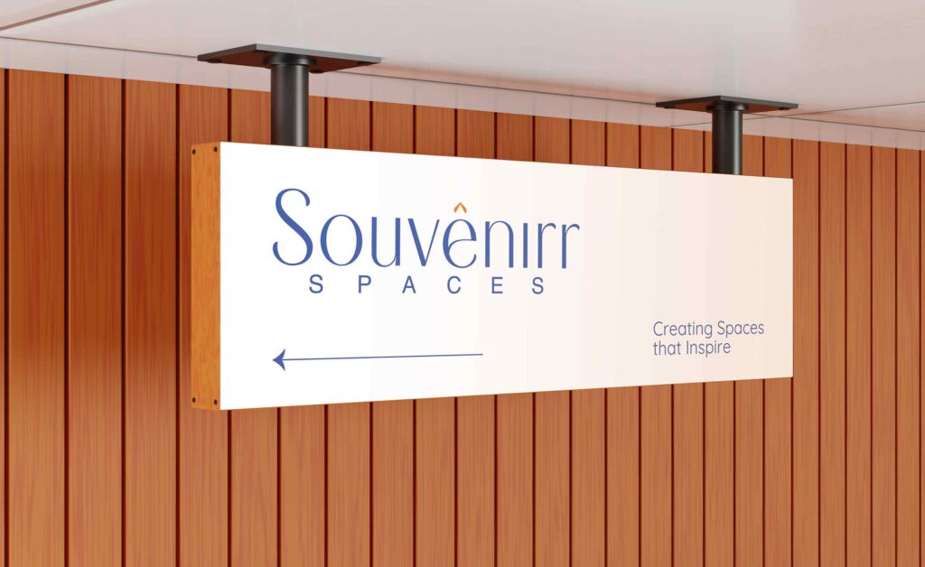
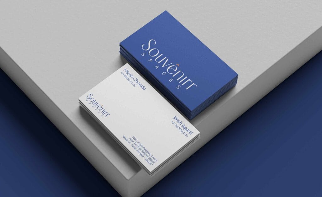
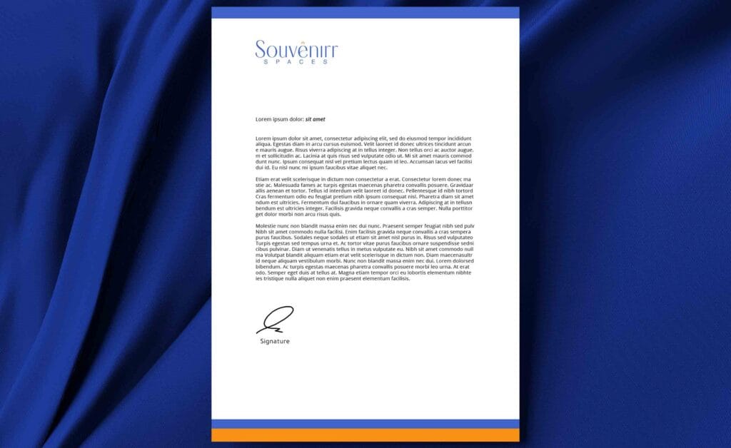
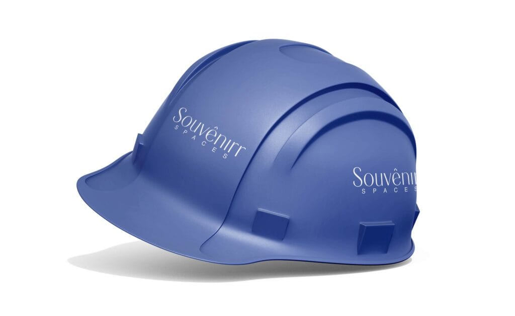
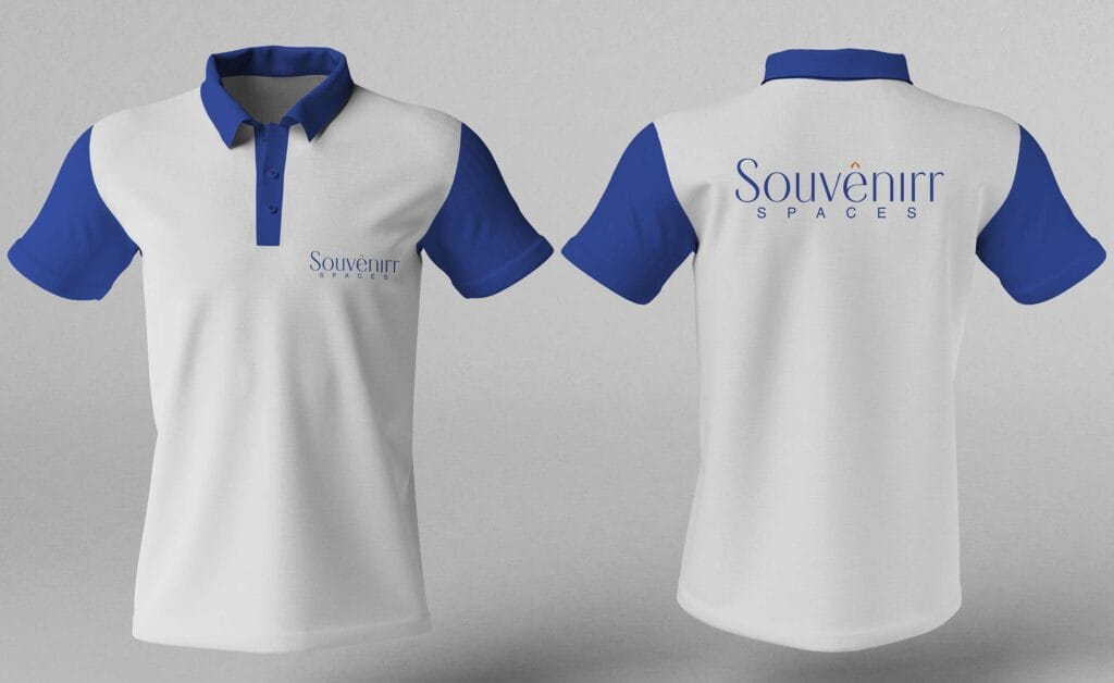
We helped client to develop a strong brand identity design directions which client would adopt for different use cases. We worked on some use cases to show how the logo would come up on different touchpoints in real life.
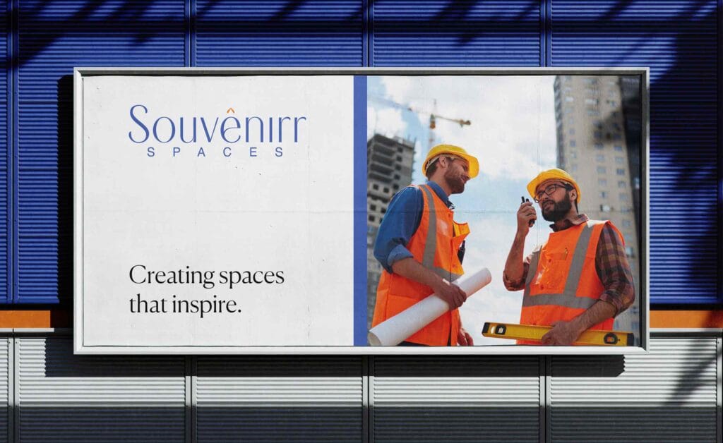
Logo would live on a hard hat at a construction site in Kandivali. On a polo shirt worn by a site visit team. On a 20-foot hoarding at a plot off SV Road. On the letterhead of a sale agreement.
Deliverables:
- Logo system, lockups, and brand guidelines document
- Letterhead and business card suite
- Branded polo shirts for the site team
- Branded construction PPE – hard hats
- Outdoor signage: hoardings, site boards, *Coming Soon* formats
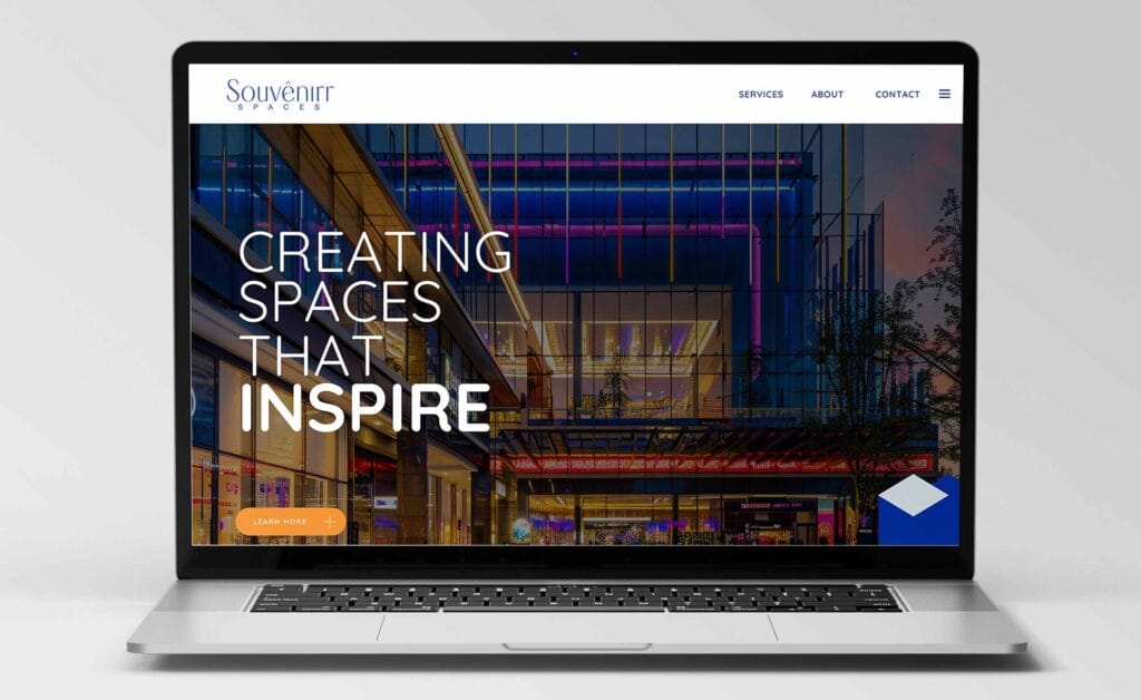
- Digital identity website hero direction with the *Creating spaces that inspire* lockup
- Email signature and presentation templates
More from our logo design work for Mumbai brands.