
Overview
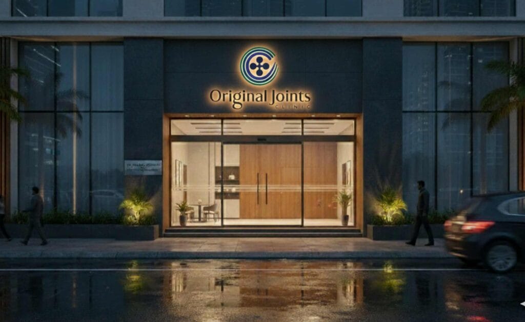
The Original Joints Clinic is a specialty medical practice in Bandra, Mumbai led by Dr. Pranjal Kodkani, dedicated exclusively to Joint Preservation Surgery, Arthroscopy, and Sports Injury Management. The clinic operates from Bandra West and treats elite athletes, active adults dealing with degenerative joint conditions, and patients from across India and abroad who have been advised joint replacement and want to preserve their natural joints first. Creative Orion designed the full brand identity for the Original Joints including the logo, colour system, brand guidelines, brand typography, and corporate identity application across clinical apparel, patient paperwork
The brief
Dr. Kodkani came to us with a clear category position. He is the only clinician in India practising joint preservation exclusively no joint replacements, no spine work, no routine fracture management. The clinic specialises in six joints (shoulder, elbow, wrist, hip, knee, ankle) and procedures most general orthopedic setups don’t lead with: MPFL reconstruction, dome osteotomy, ACL reconstruction, all delivered through minimally invasive arthroscopic technique.
The brief from Dr. Kodkani reflected that positioning precisely. The brand essence words he gave us ethical, premium, unique, exclusive, pioneering, scientific, caring, safe, trust, reliable, opinion that others may not give, genuine, not commerce driven, for the client’s benefit read as the explicit opposite of how a high-volume replacement-focused practice would describe itself.
The visual constraints followed from the medical ethic. Warm colours red, orange- were off-limits, because in medical visual vocabulary they signal pain, injury, alert, emergency.
Cool tones were preferred: blue, teal, the palette of calm, of healing, of the body intact rather than the body in crisis. Typography needed to feel classy, impressionable, and rich but not the sterile sans-serif of a hospital signage system, but something that carried the gravity of a specialty practice. The name *Original Joints* had to remain in the wordmark.
That was the brief. The work followed from it.
What we did
Logo
We designed multiple options and explored different directions. The client finalise the four-lobed glyph direction.
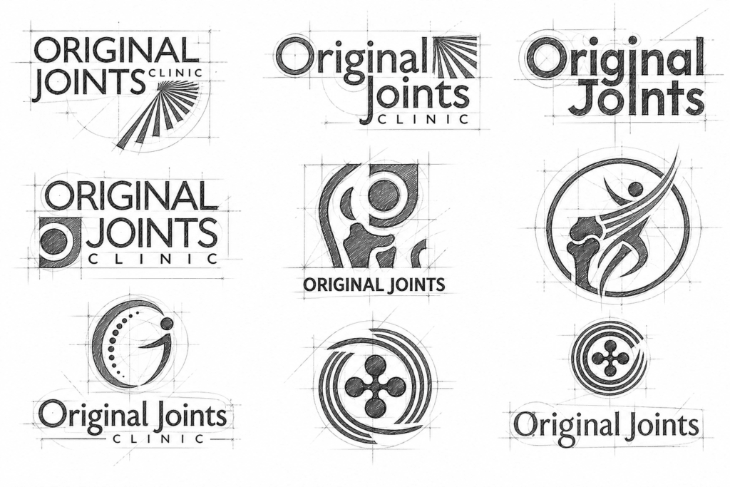
The logomark is a four-lobed glyph at the centre, surrounded by open arcs in motion. Every element of the construction carries meaning that traces back to the medical philosophy.
The four-lobed shape at the core suggests joint structure interconnected movement points, balance, controlled motion.
The arcs around the core carry the strategic weight. They are deliberately open not closed circles. A closed circle would have implied restriction the joint walled in, contained, treated as a sealed system. The open arcs imply the opposite: minimally invasive entry points, progressive healing, motion that is preserved rather than locked down. This is the visual translation of the surgical method arthroscopic procedures that enter the joint through small openings to preserve, not to replace. The Original Joints wordmark uses a refined serif. Most contemporary medical identity work defaults to clinical sans-serifs, which signal sterile competence but lack warmth. A serif here reads as specialty practice, considered tradition, expertise that has earned the right to a more deliberate letter form. The lockup pairs the serif primary with a tracked-out CLINIC sans-serif beneath
Colour
We choose the palette entirely on cool tones, in line with the client’s no-warm-colours constraint and with the medical reasoning behind it.
The primary palette runs across four cool values: a deep teal-green (#327065), a deep blue (#274B91), a medium teal-blue (#265775), and a near-black navy (#1A2748). Together they form a system that reads as preserved and calm.
For the secondary palette we chose the range with lighter teals and a brighter blue, plus one disciplined warm accent (#FF7043) reserved for very specific contexts where energy needs to be introduced without breaking the cool dominance.
The brand’s no-warm rule is not aesthetic preference. It’s a brand rule that mirrors a clinical philosophy.
Typography
A developed a four-font system, each font assigned to a specific application surface so the brand stays coherent across clinical paperwork, environmental signage, and digital interfaces.
The system means a patient’s experience of the brand stays consistent from the discharge summary they take home, to the signage in the consultation room, to the website that brought them to the clinic in the first place.
Corporate Identity application
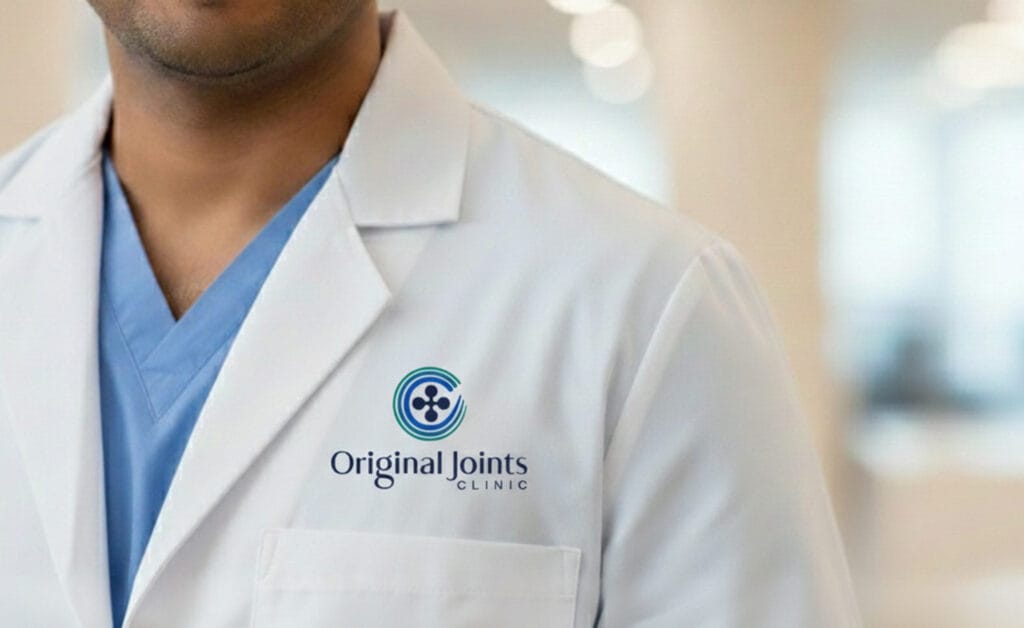
A medical brand identity has to live across surfaces that most consumer identities never touch. A patient sees the brand on the white coat their surgeon is wearing during consultation. On the clipboard holding their medical history. On the form they sign before a procedure. On the post-operative paperwork they take home. On letterhead and business card they share.
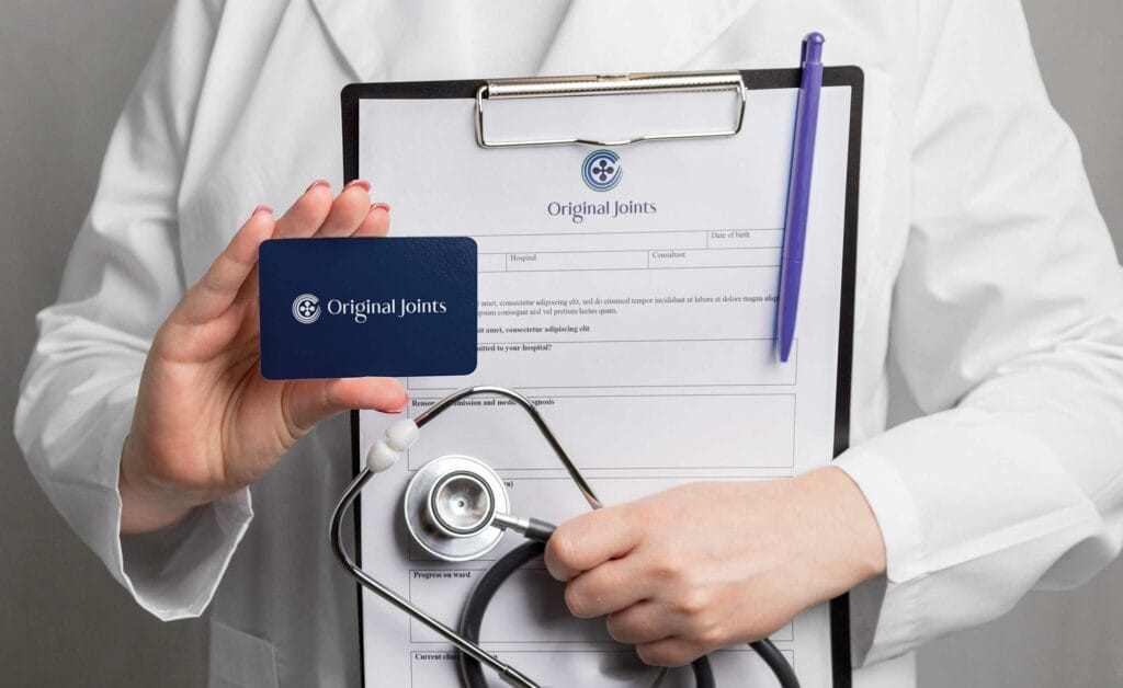
We built the corporate identity across all of those surfaces:
- White coat embroidery with the horizontal lockup
- Branded clinical clipboards with the wordmark applied across patient intake and consultation forms
- Business card system in the deep navy primary
- Medical letterhead and stationery suite
- Prescription pad and discharge summary templates
- Patient-facing forms with the logo applied at a scale and clearance the brand guidelines specify exactly
- Brand guidelines document defining logo usage, clearance, what-to-avoid, colour values (HEX, RGB, CMYK), and the typographic hierarchy

