Creative Orion is a branding and website design agency with offices in Faridabad, Gurgaon and Delhi. We built the complete brand system for Global Solutions, a strategic and financial advisory firm based at Emaar Digital Greens, Tower B, Sector 61, Gurugram. The scope ran from the logo through to the brand guidelines document, the corporate identity suite, the office branding, and the website at globalsolutions.net.in. Global Solutions advises businesses on private equity, debt syndication, mergers and acquisitions, operational excellence and corporate legal matters. Every surface a prospective client encounters before signing a mandate came out of this project.
The Challenge
Global Solutions approached Creative Orion for strong branding not for a logo. That distinction shaped the entire project.
The firm had already assembled the substance. Its team is drawn from global financial institutions, consulting firms and corporate law practices, and it works across capital raising, transaction execution and operational turnaround. What it did not have was a way of making that substance legible from the outside. A promoter deciding who should run their fundraise, or a board choosing an advisor for an acquisition, forms a judgement long before the first meeting from a signature block, a teaser document, a reception wall, a website loaded at 11pm.
So the brief was not a mark. It was every one of those surfaces, built to say the same thing.
What makes financial advisory branding different
In most sectors, the brand introduces the product. In advisory, the brand has to carry credibility before the firm is allowed to demonstrate any. A client hands over financial statements, cap tables and confidential plans before anything is signed. The decision to do that is made partly on evidence and partly on how serious the counterparty looks.
Global Solutions also competes for that decision against firms whose names have been in the market for decades. A new identity does not get a running-in period. It has to belong in the room on day one.
That ruled out a whole category of design choices. No decorative mark, no growth-arrow cliché, no palette borrowed from consumer tech. The system had to read as institutional without reading as generic, and it had to hold up at the size of a favicon and the size of a wall.
The logo
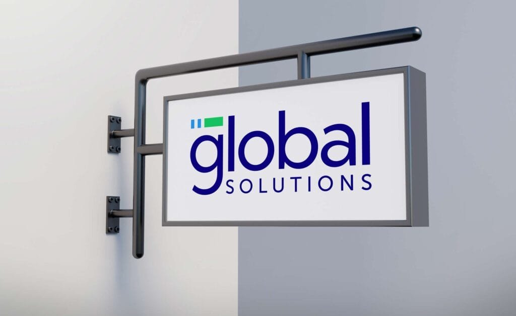
We designed the Global Solutions mark to work as a pair of lockups from the outset: a primary version for light backgrounds and a reversed white version for dark ones. Both were delivered as vector SVG, which is why the site can carry the reversed mark over the photographic hero banner and the primary mark in the footer without any loss of quality at any screen size.
Restraint was the governing decision. The mark does not try to illustrate what private equity or debt syndication is. It is built to sit quietly at the top of a document that a fund partner is reading, and to be recognisable at the bottom of an email signature. As on every Creative Orion logo project, the client received four revisions per concept, the open-source working files, and a full transfer of copyright in the final mark.
The brand guidelines
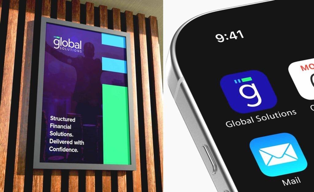
The guidelines document is the part of this project that does the most quiet work. Global Solutions produces material that travels without anyone from the firm attached to it information memoranda, teasers, valuation decks, term sheets, board papers. Those documents are assembled by different people under time pressure, and they land in front of exactly the audience the firm is trying to impress.
The guidelines fix what those documents look like. Colour values across print and screen, the typographic scale, clear space and minimum sizes for the mark, correct and incorrect usage, and how the identity applies to documents and presentations. It is the difference between a firm that looks the same in every room and a firm that looks slightly different every time.
The corporate identity
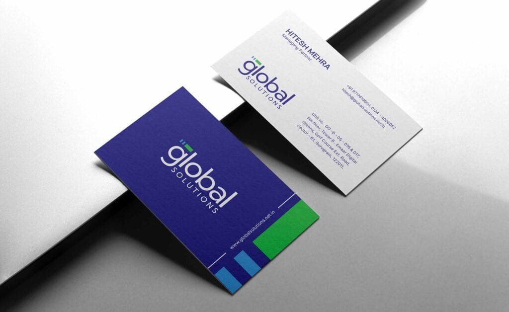
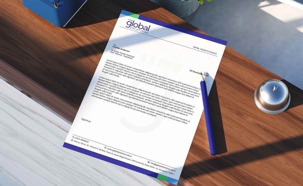
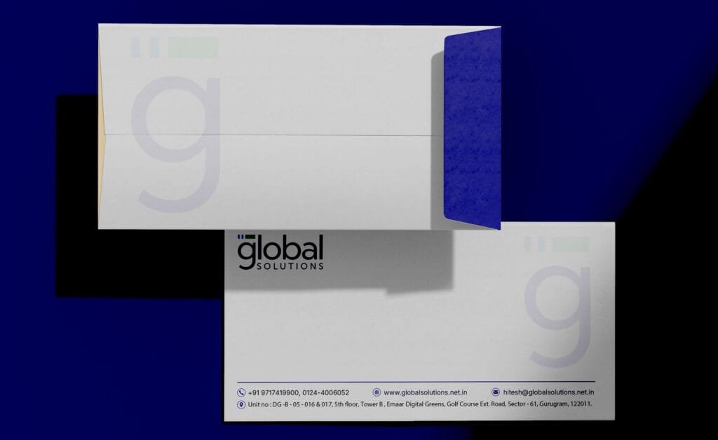
From the guidelines we produced the corporate identity set the firm uses daily the business card, the letterhead, the envelope, the email signature and the presentation template. These are the artefacts that do the introducing. A card is handed across a table at Emaar Digital Greens; a letterhead carries an engagement letter; a deck template makes sure that a pitch built overnight still looks like it came from the same firm as the one built last month.
The office branding
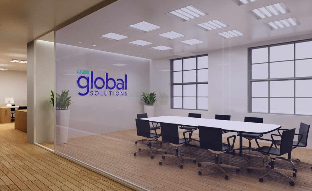
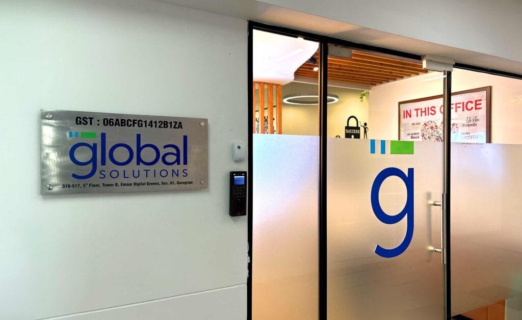
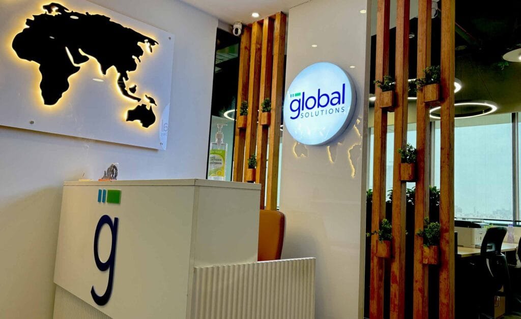
Office branding is the part most firms leave out, and it is the part a prospective client physically walks through. Global Solutions occupies the fifth floor of Tower B at Emaar Digital Greens on Golf Course Extension Road a building where a visitor has usually already passed several other advisory and consulting firms on their way up.
We applied the identity across the office environment so that the moment of arrival matches everything the visitor has already seen on screen and on paper. The reception, the wayfinding and the meeting spaces carry the same mark, the same colour and the same typographic voice as the website and the documents. It is the point where a brand stops being a file and becomes a place.
The website
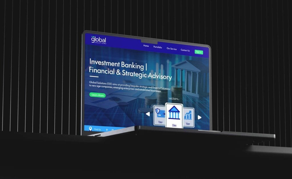
We built globalsolutions.net.in on Drupal 11, with a custom theme rather than a purchased template. The site is structured around how the firm is actually shortlisted: a positioning line, a plain statement of what the firm does, and then five dedicated service pages for private equity, debt syndication, mergers and acquisitions, operational excellence and corporate legal advisory.
Two structural decisions are worth naming. First, the service pages open with the client’s problem rather than the firm’s capability the debt syndication page begins with traditional banking relationships failing scaling enterprises, not with a list of what Global Solutions offers. Second, the News Room curates live market sources including Business Standard’s mergers and acquisitions coverage, its industry desk, and RBI press releases. That was a deliberate choice: it positions Global Solutions as a firm that reads the market every day rather than one that publishes a post every few months.
The enquiry form carries a service selector mapped to the five practice areas, so an enquiry arrives already sorted into the right desk. The hero line Empowering Decisions. Enabling Growth sets the tone the rest of the system holds.
Where the brand stands now
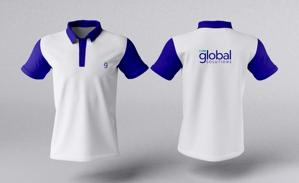
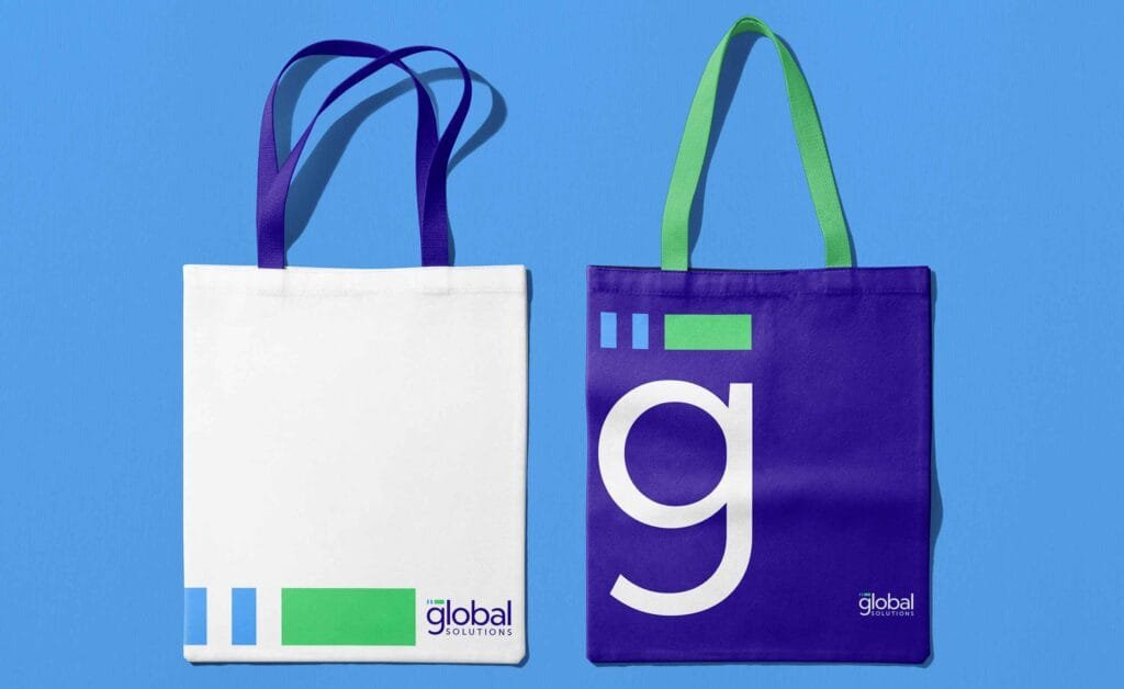
Global Solutions now presents as one firm across five touchpoints that used to be five separate decisions. The mark, the document set, the office, the website and the enquiry experience were all designed together, from the same guidelines, in the same project. For a firm whose entire proposition is that it brings order to complicated situations, looking coherent is not a cosmetic benefit. It is the argument.